MobileAction
Designing a Scalable Onboarding Experience for a Powerful ASO & Ad Management Platform.
Goal
To design a user-friendly solution that optimizes training for runners, enables seamless progress tracking, and boosts motivation. The final design will provide intuitive navigation and data-driven insights, catering to both amateur and professional runners.
Role
Senior Product Designer
Industry
SaaS
Duration
3 Days
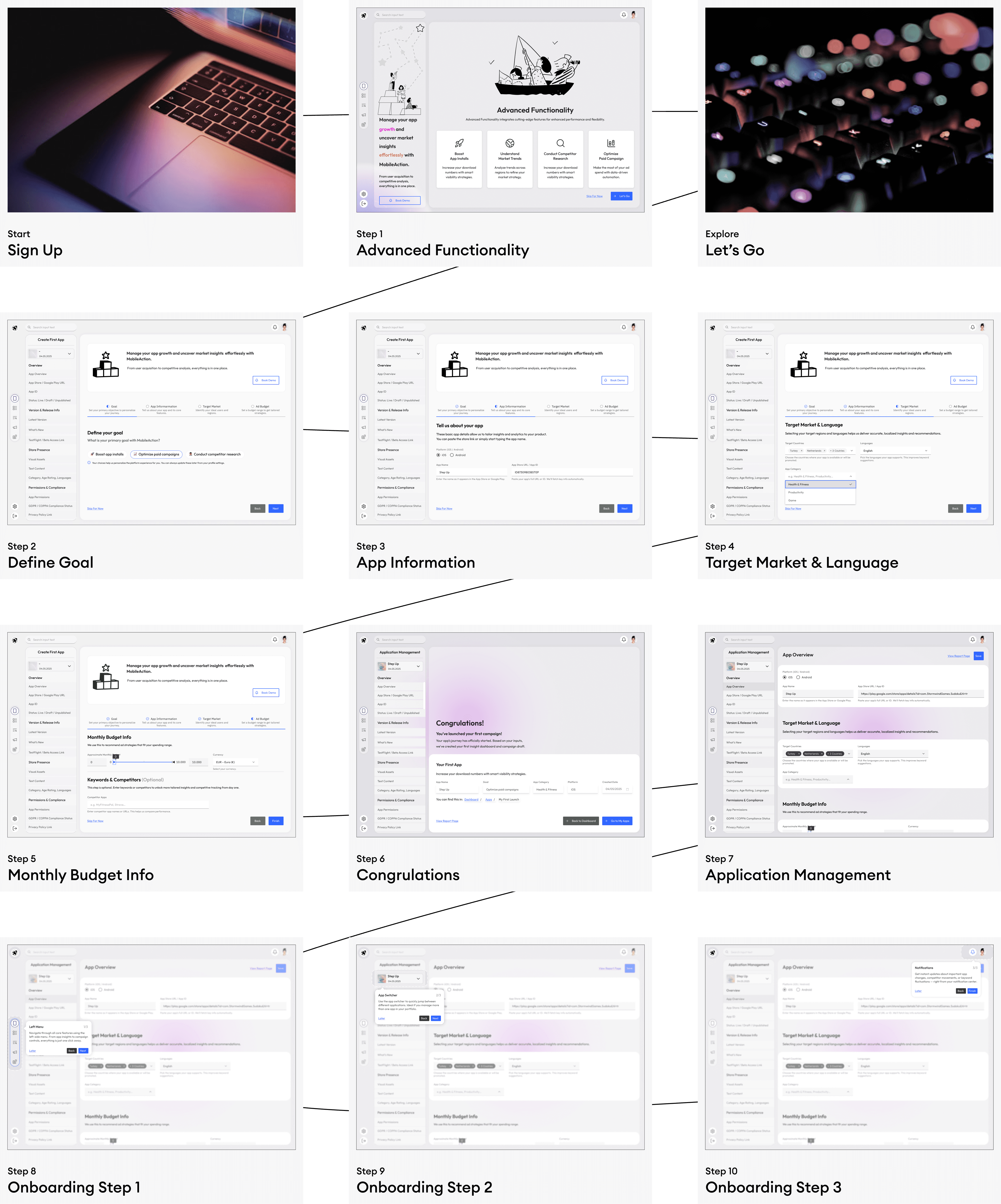


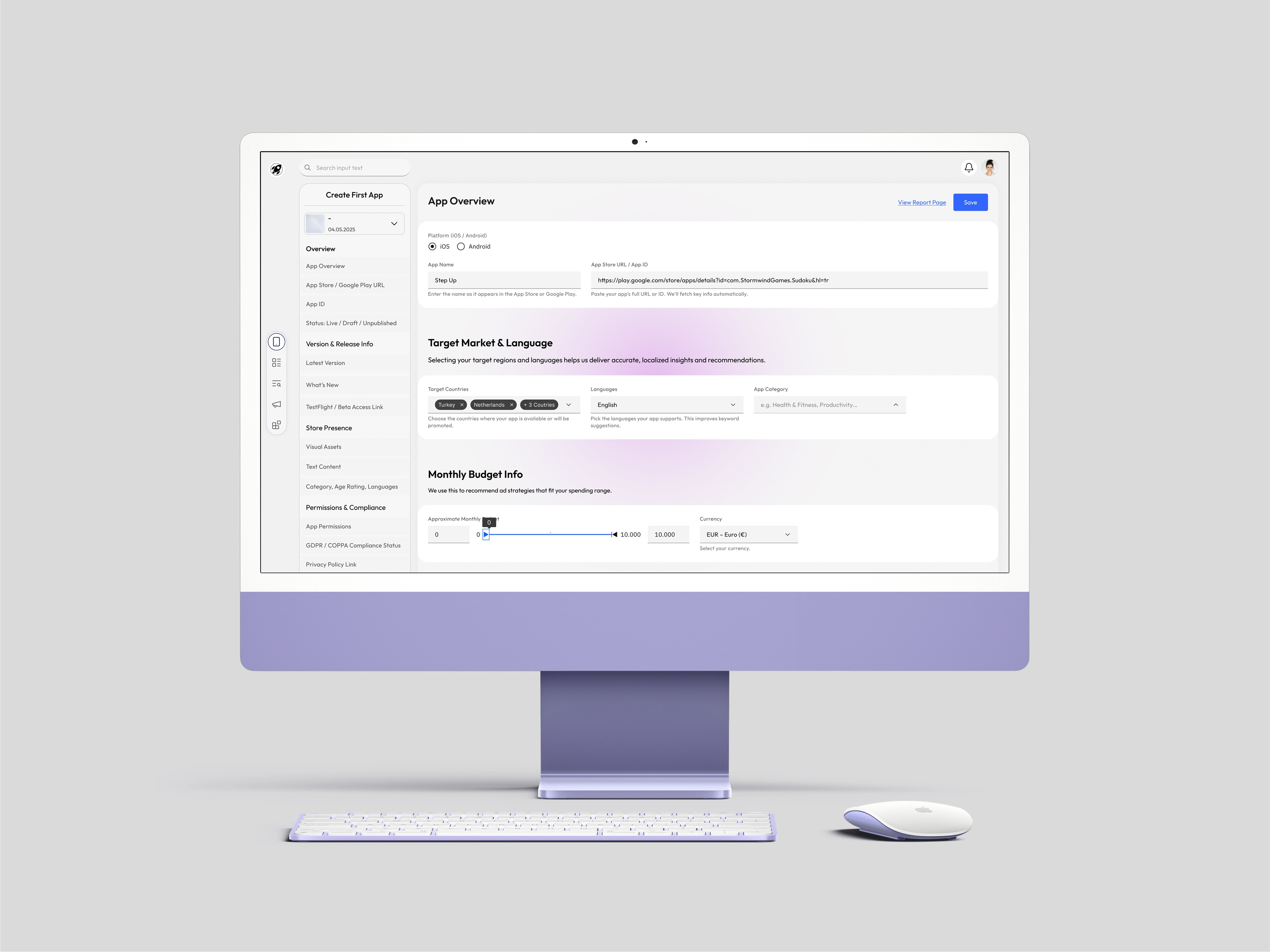
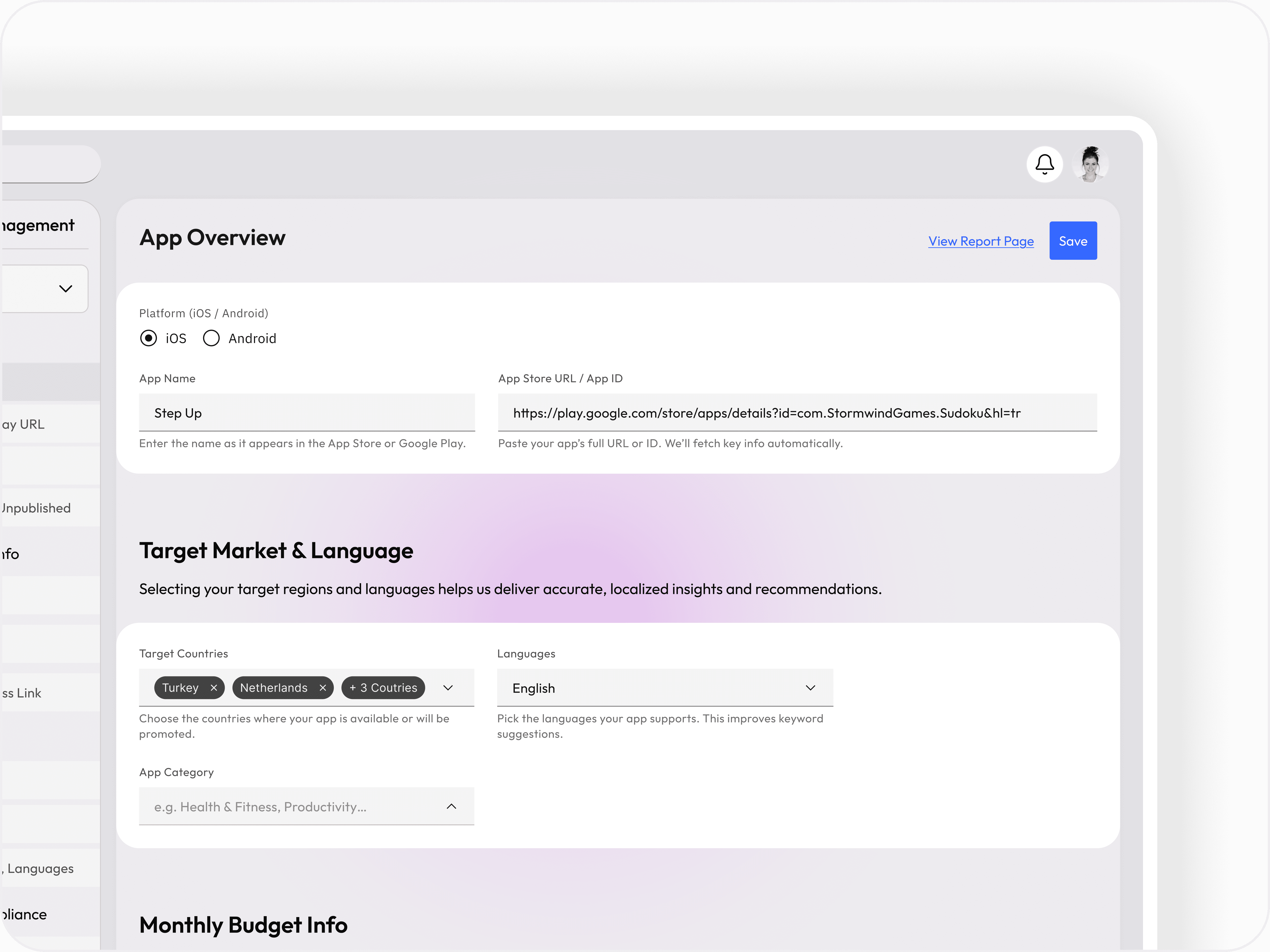
App Setup Flow — Understanding the Product to Personalize the Experience
To ensure that users receive insights tailored to their product and growth goals, I designed a 4-step flow that captures the essential context of their app. Each step is purposefully structured to reduce cognitive load and maintain a sense of progress.
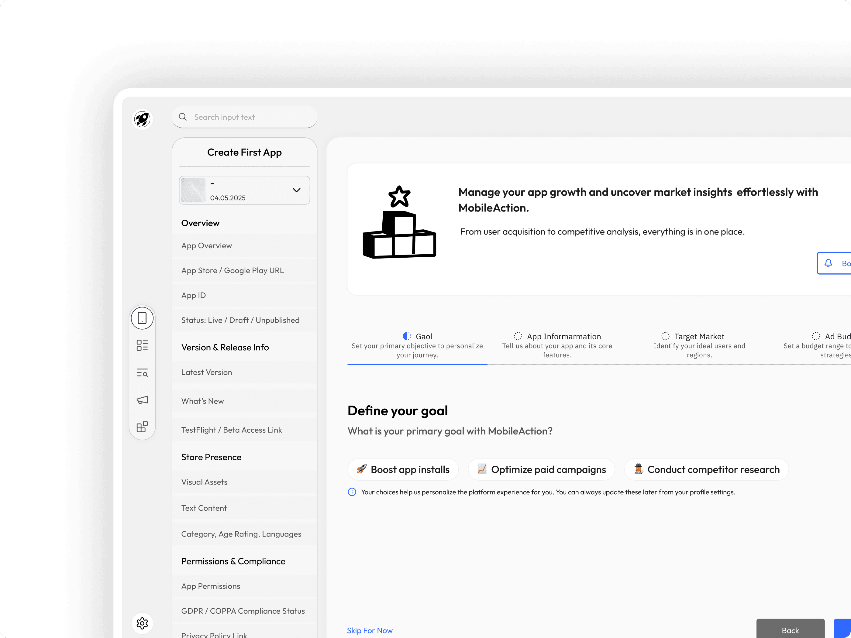
Step 1 — Define Your Goal
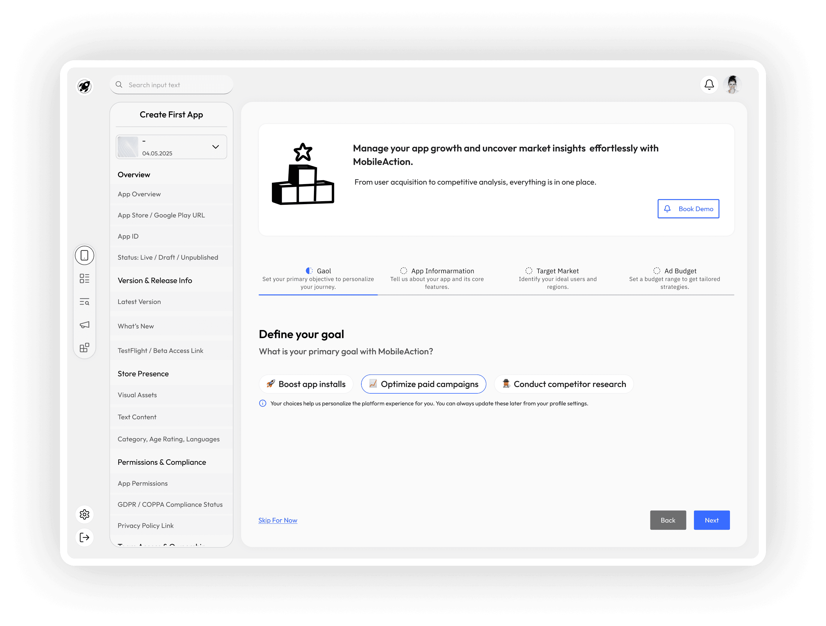
Objective: Align the platform’s intelligence with the user's expectations.
In the first step, users are asked to define the primary goal they want to achieve using the platform — such as increasing installs, optimizing ad strategy, or analyzing market competition. This selection guides the personalization of recommendations and dashboard focus.
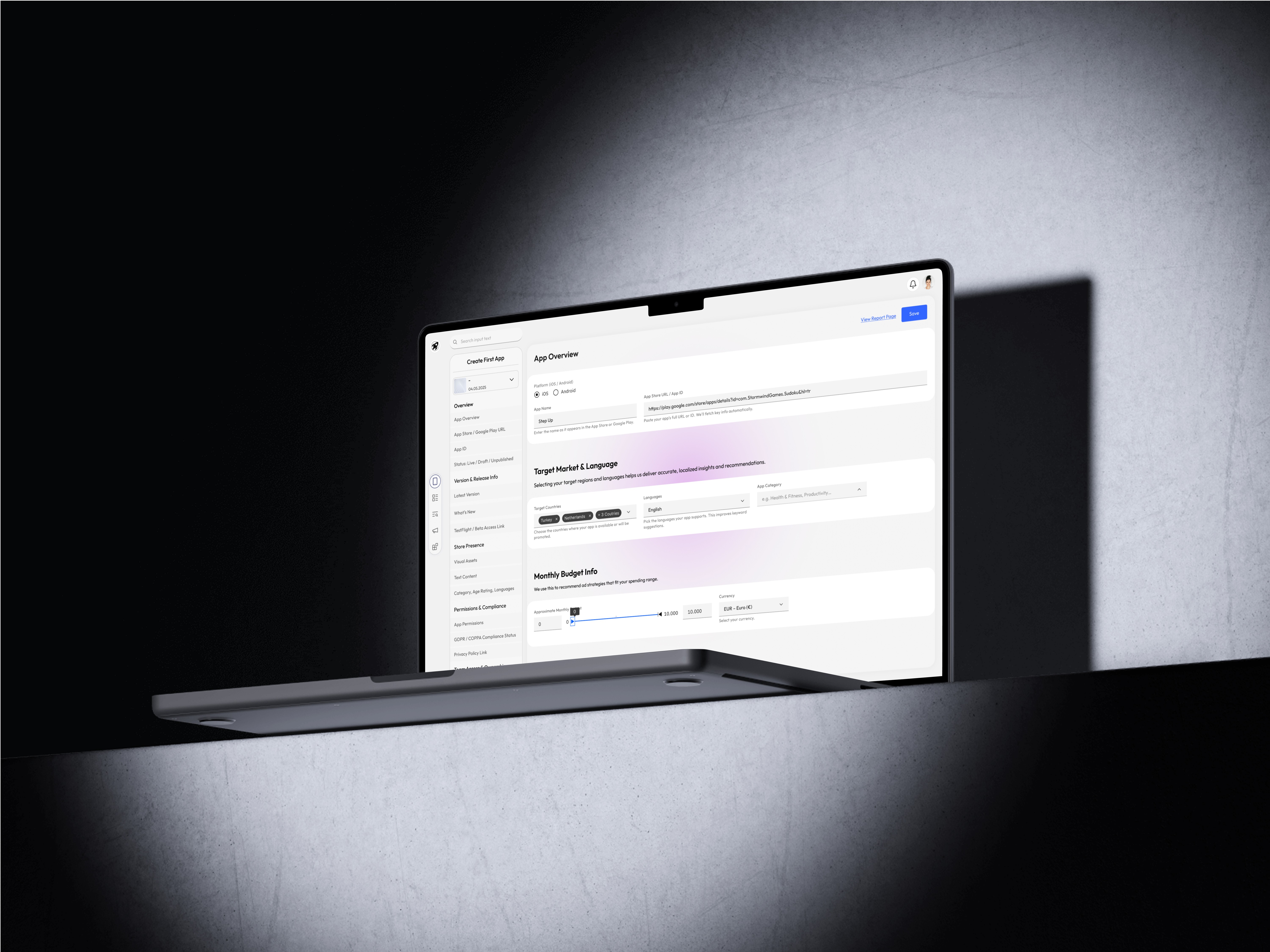
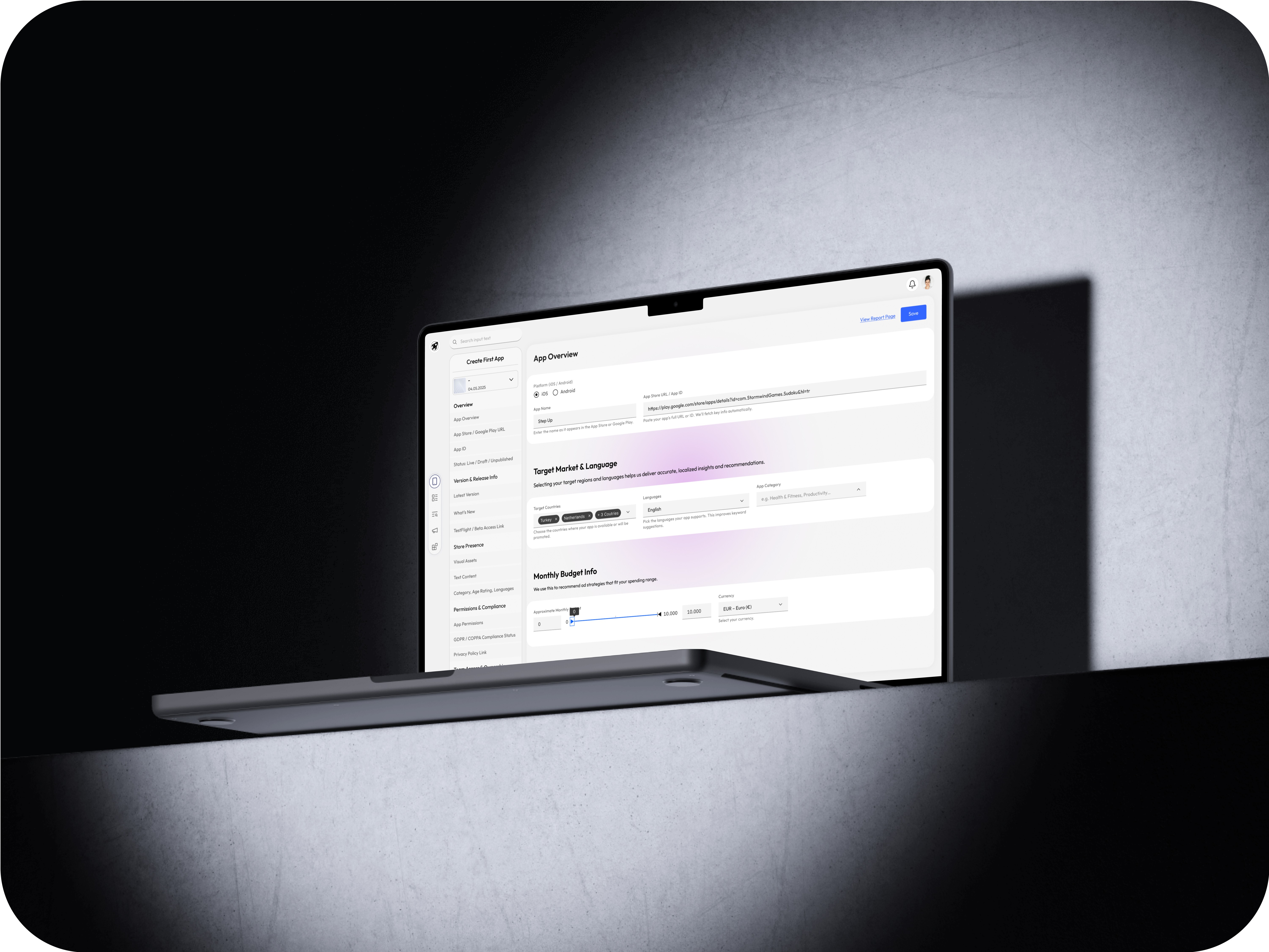
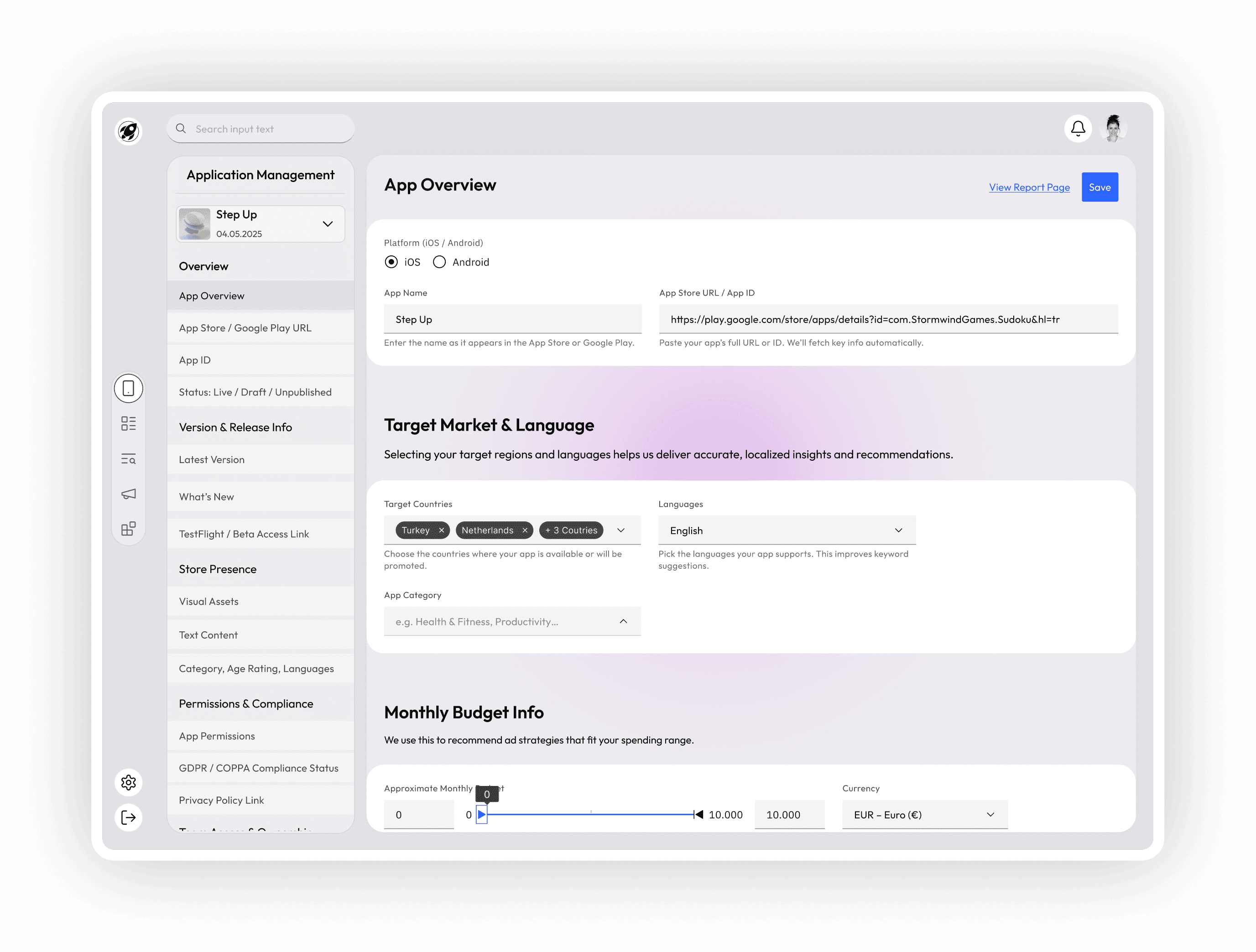
Step 2 — App Information
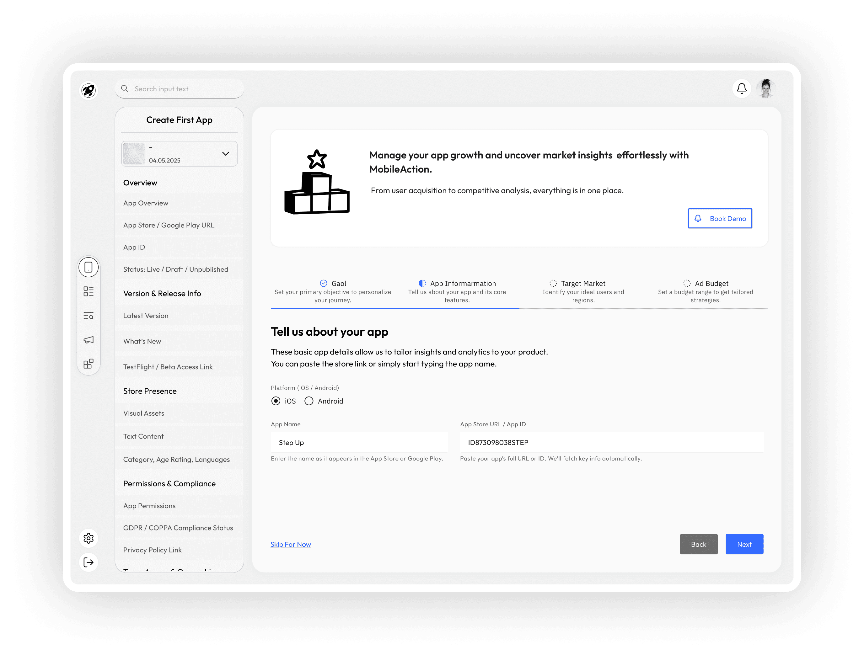
Objective: Gather key metadata to connect external data sources.
Here, users provide basic but critical details like the platform (iOS/Android), app name, and store URL or ID. This information allows the system to automatically retrieve relevant data (ratings, downloads, category) and prepares the groundwork for benchmarking and competitive analysis.
Step 3 — Target Market
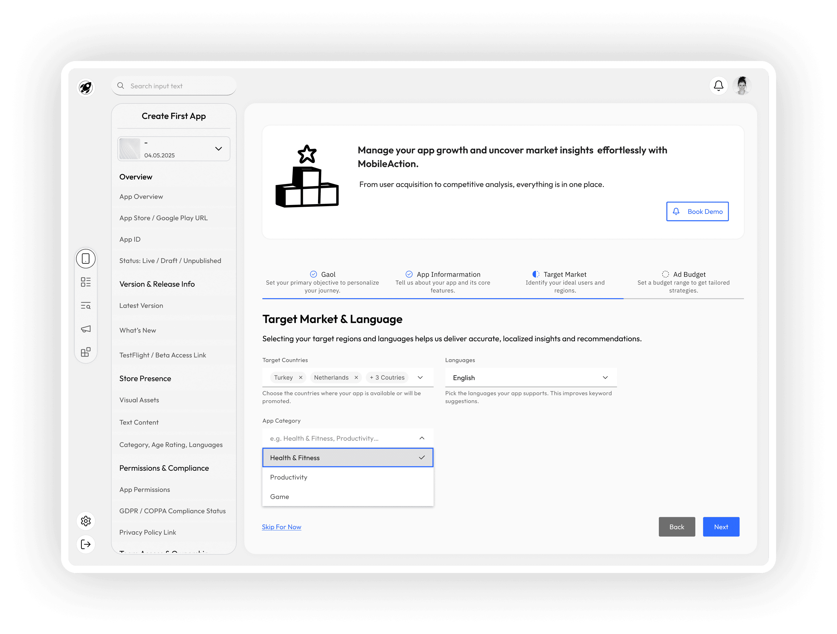
Objective: Identify the app’s primary audience and regional focus.
To refine market trend insights and user acquisition strategies, users are prompted to select their key target regions and user personas. These inputs are used to filter trends and benchmark performance against relevant markets.
Step 4 — Ad Budget
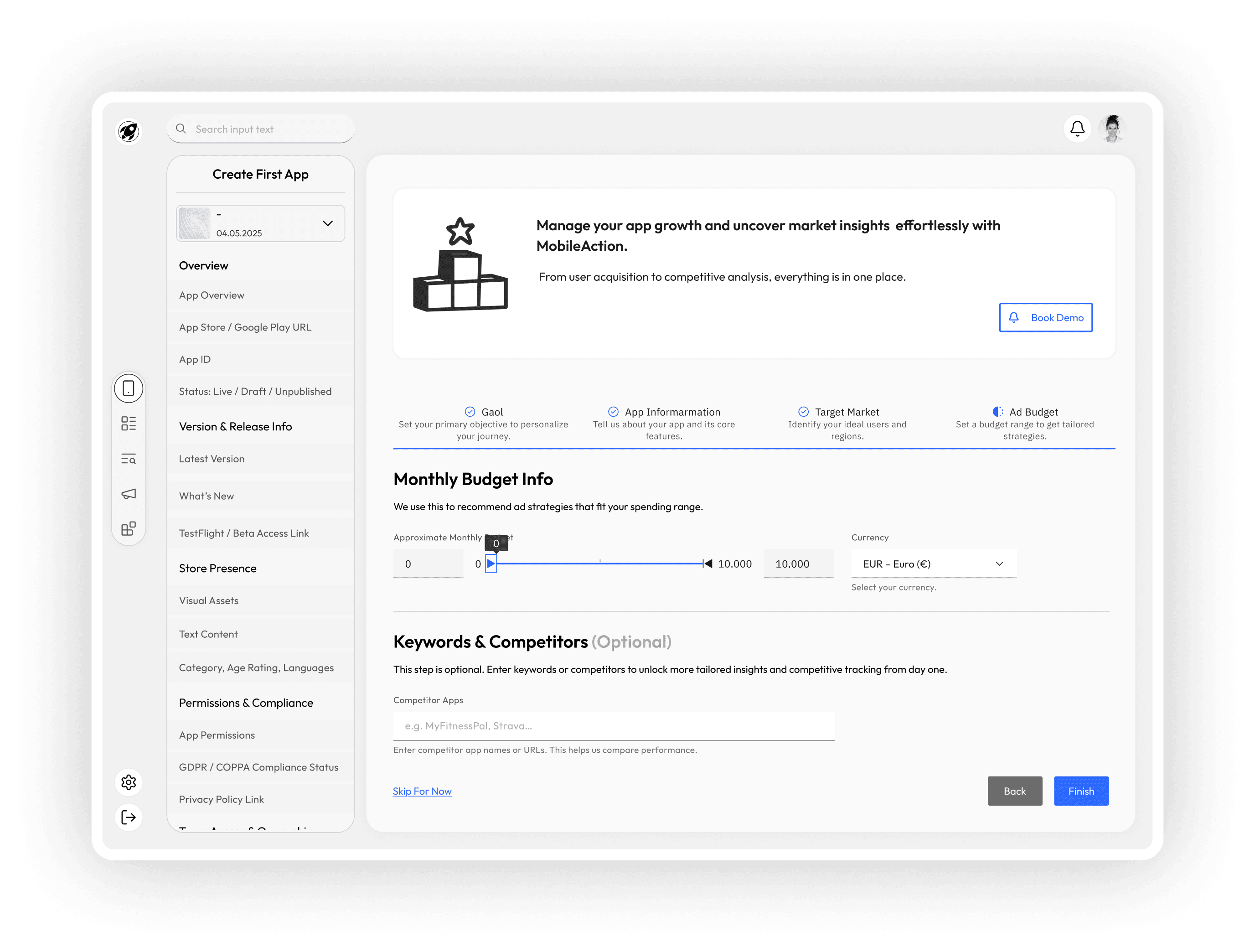
Objective: Provide budget visibility for strategic planning.
Finally, users define their expected advertising budget range. This enables the system to suggest feasible campaign strategies, allocate resources efficiently, and compare performance metrics against similar-scale competitors.
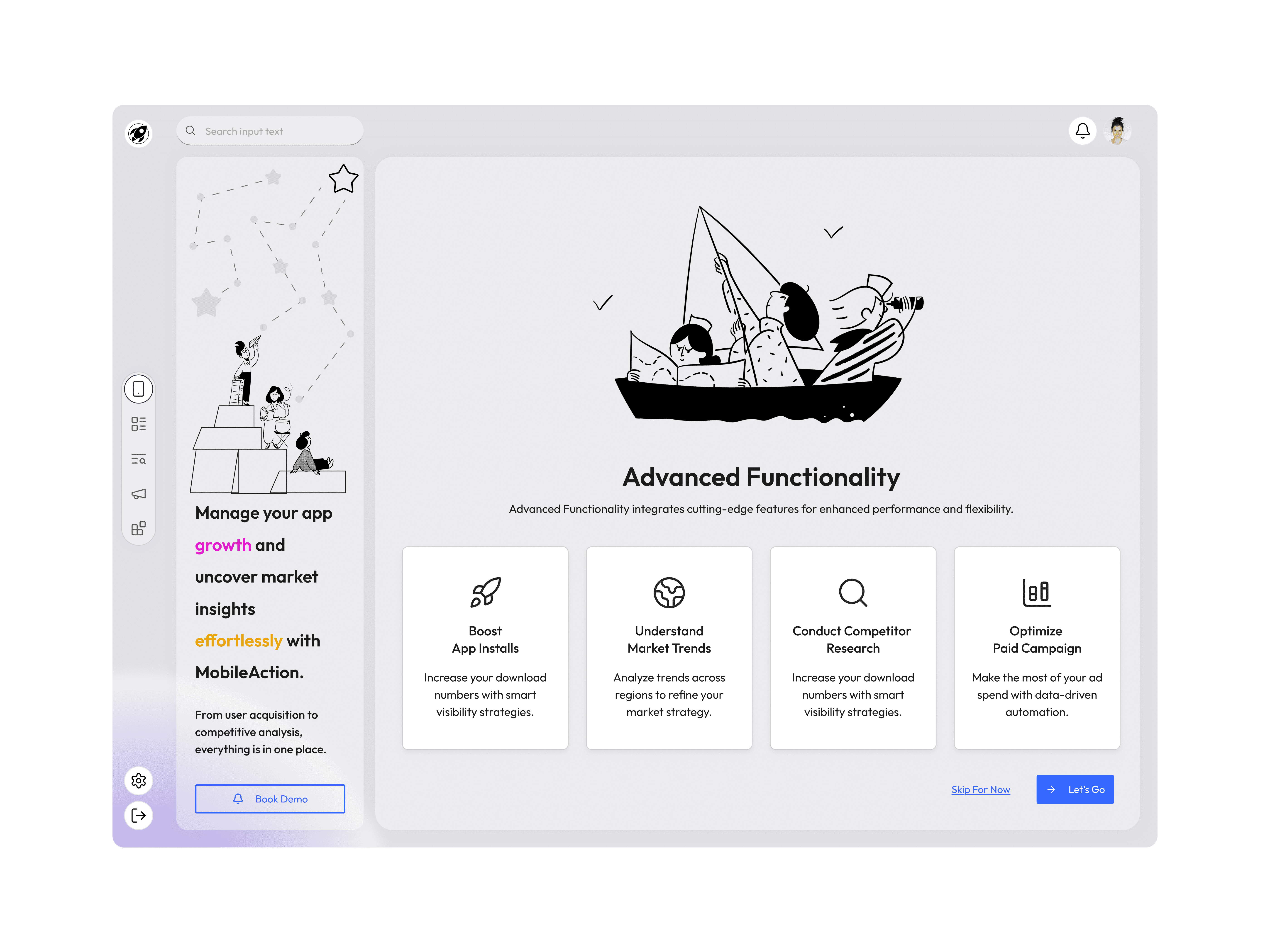
Congratulations Screen — Summary and Seamless Transition to Action
After completing the multi-step app setup flow, users land on a congratulatory screen that not only celebrates their progress but also offers a quick summary of the data they’ve just provided. This helps users feel confident that their input has been registered correctly, and it eliminates ambiguity about what comes next.

Key Functions of This Screen
Progress Confirmation: A concise summary of the app details the user has just submitted (e.g., app name, platform, market info, budget) gives them clarity and closure.
Actionable Next Steps: Users are now offered three distinct pathways based on their intent:
Go to Dashboard – For those who want an overview and to begin deeper exploration.
View Report – For users ready to dive into insights and analytics right away.
See App Details – To review or refine the specific app data they’ve just entered.
Design Rationale
This screen is designed to act as a soft landing into the product experience, converting a setup completion into a meaningful starting point. It also reduces cognitive load by summarizing key information before handing users off to more complex views.
UX Consideration
The availability of multiple navigation choices empowers users with flexibility and supports different usage motivations — whether they are insight-driven, exploratory, or detail-oriented.
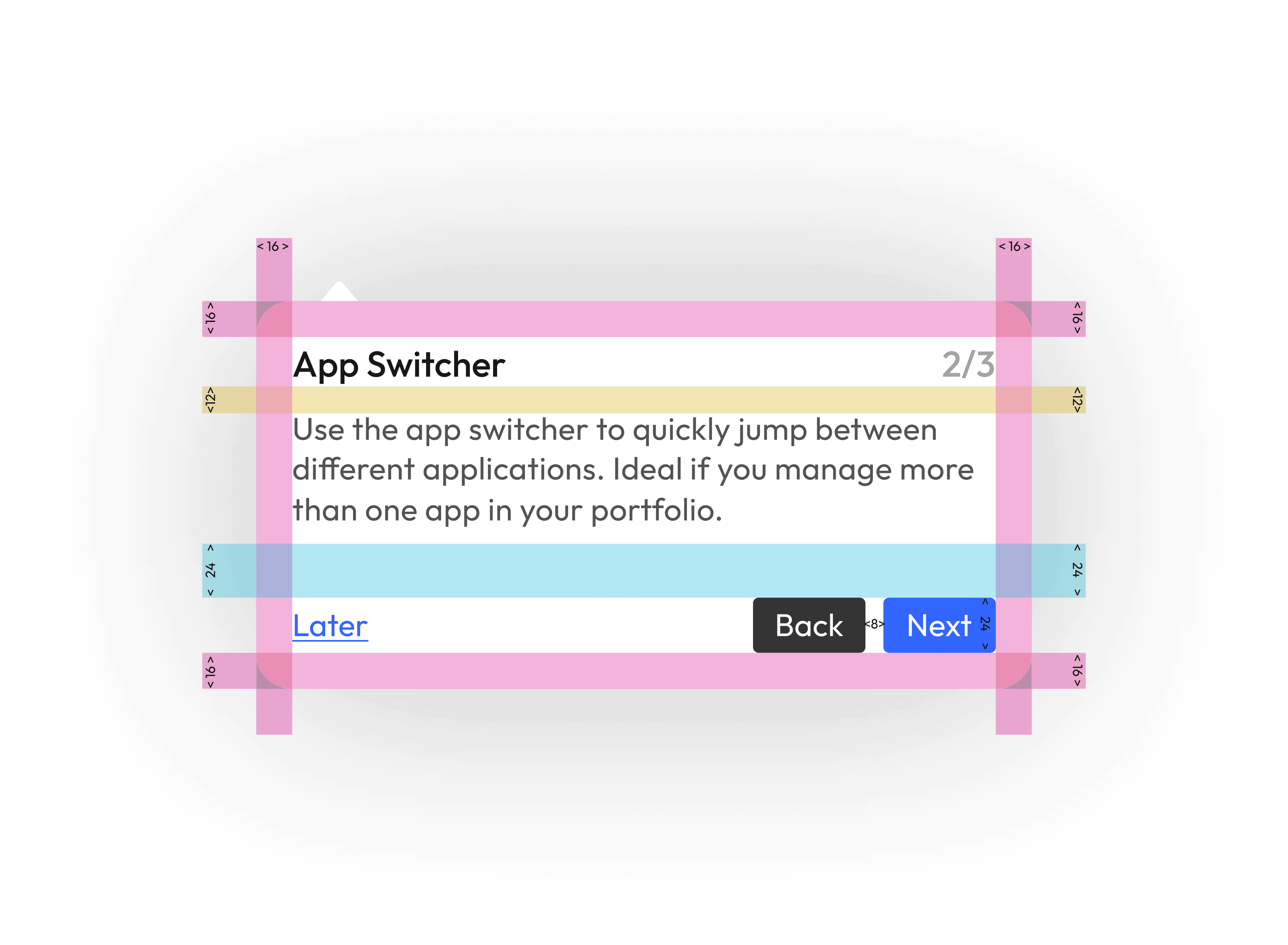
App Tour — Helping Users Feel Oriented and Empowered After First Launch
After completing onboarding and creating their first app, I designed a brief, contextual App Tour to familiarize users with the platform’s interface and key navigation points.
Why an App Tour?
Even the most intuitive platforms can benefit from quick, purposeful guidance. Since this product offers multi-level data and competitive insights, the App Tour helps reduce cognitive load and encourages user exploration by highlighting essential features.
App Tour Steps
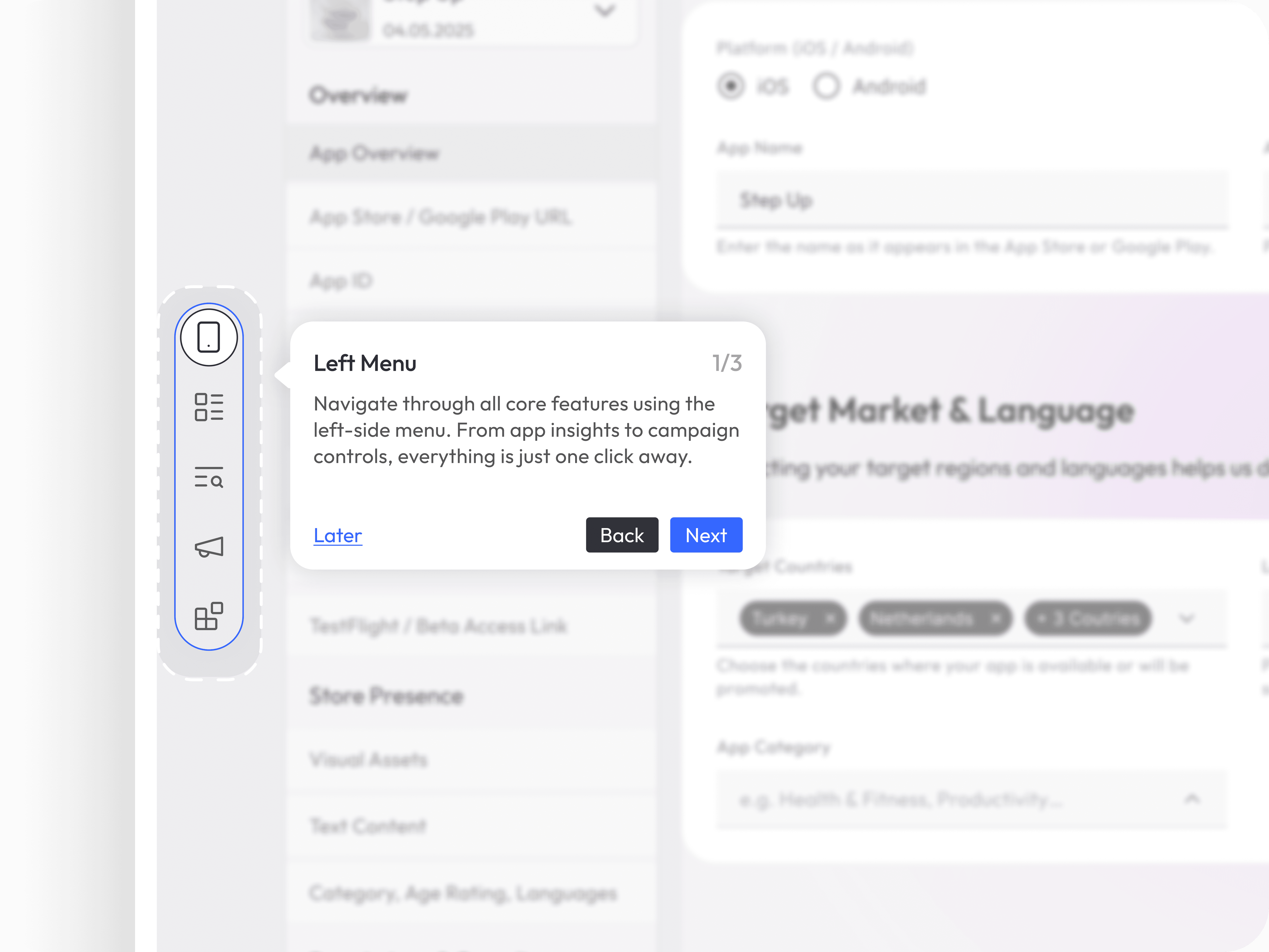
Step 1: Left Main Menu
Users are first introduced to the main navigation menu — the command center of the product.
I used the existing MobileAction menu structure as a reference.
The tour briefly explains where users can find modules like Reports, ASO, Market Intelligence, Campaign Management, and more.
A tooltip highlights the icons, providing a short description of each.
“This is your main control panel — quickly access every major module from here.”
Step 2: App Switcher
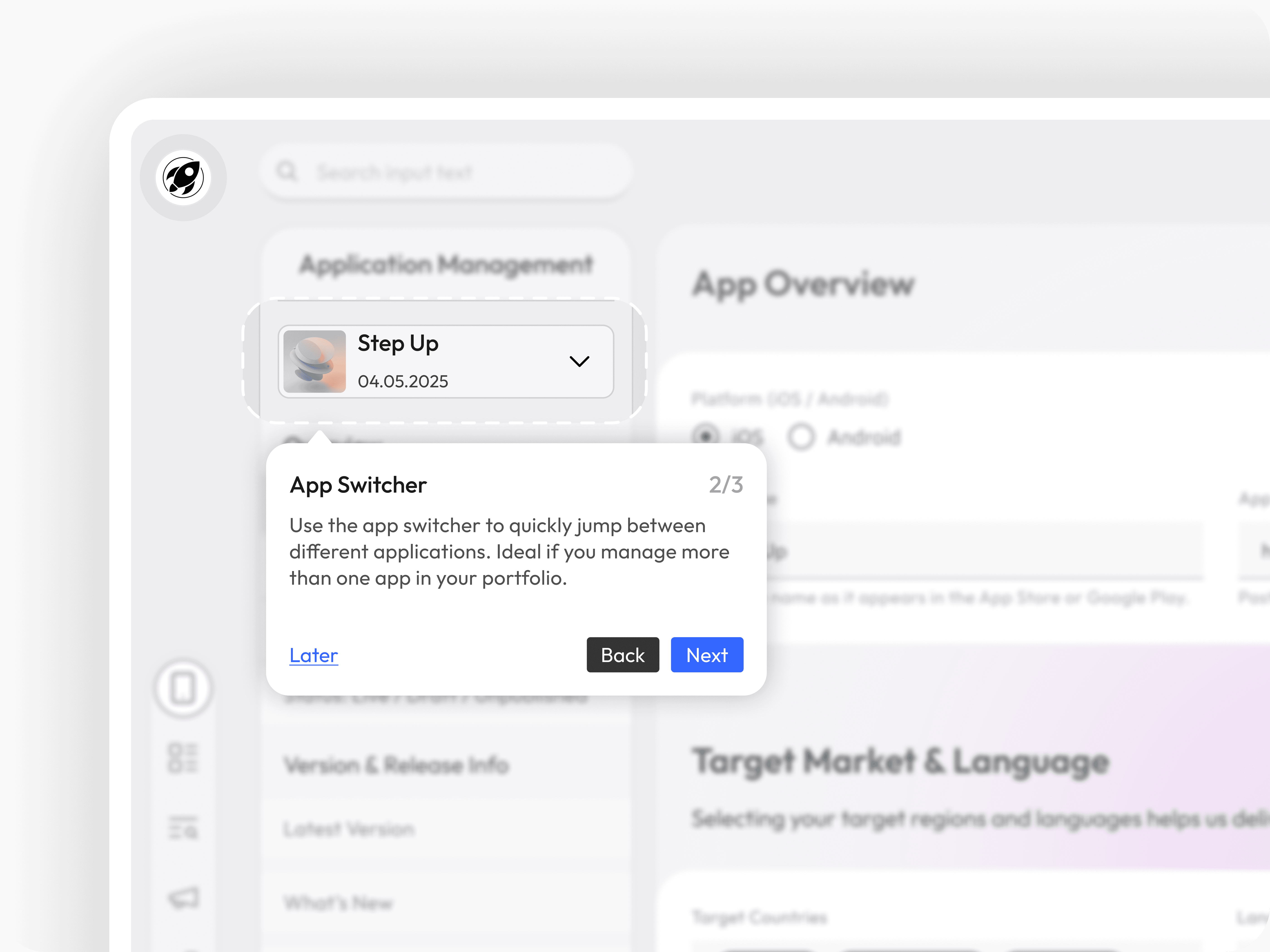
Next, users are guided to the App Switcher, located typically in the top-left area.
This feature allows users to seamlessly switch between multiple apps they manage.
Especially useful for users handling multiple products across markets or platforms.
Encourages exploration and centralizes control.
“Switch between your apps effortlessly — manage each product’s data from a single place.”
Step 3: Top Bar Notifications
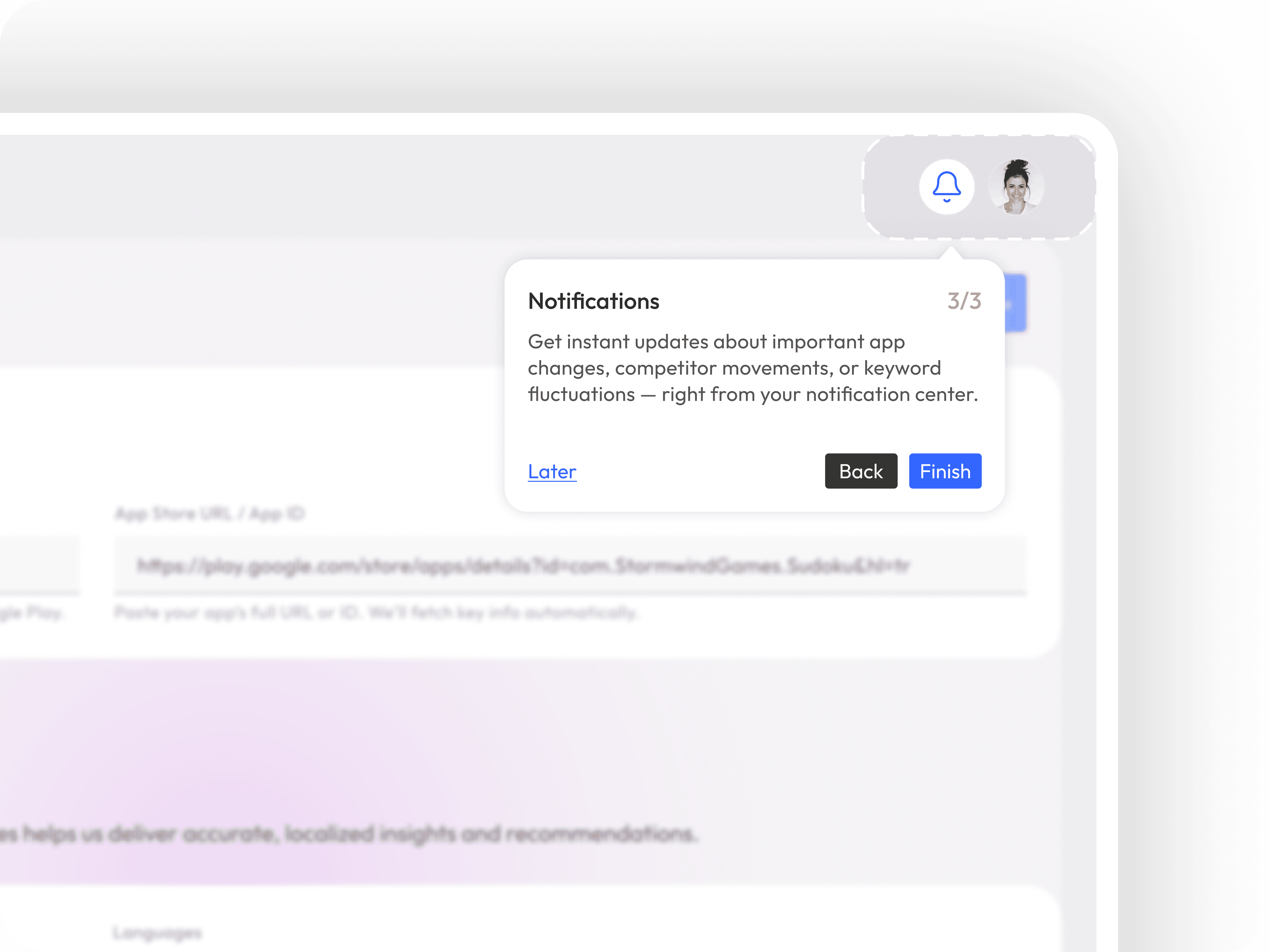
Lastly, users are shown the notification center in the top bar.
This is where they'll receive alerts about data anomalies, competitor movements, budget alerts, or report completions.
Ensuring visibility here keeps users informed and proactive.
“Stay up to date with real-time alerts and reports — all your notifications live here.”
Design Approach
Tooltip-based navigation was preferred over modal walkthroughs to avoid interrupting the user’s flow.
Non-intrusive skip option included in every step.
Progress indicator and subtle animations guide user attention without overwhelming them.
Other projects
Cybersecurity Management for Banks and Branches
ABC is a desktop app that verifies how prepared banks are against 'cybersecurity threats.'
Getir Oto / Design Case
Revolutionizing the educational ecosystem with a mobile app designed to enhance interactive learning and peer collaboration.
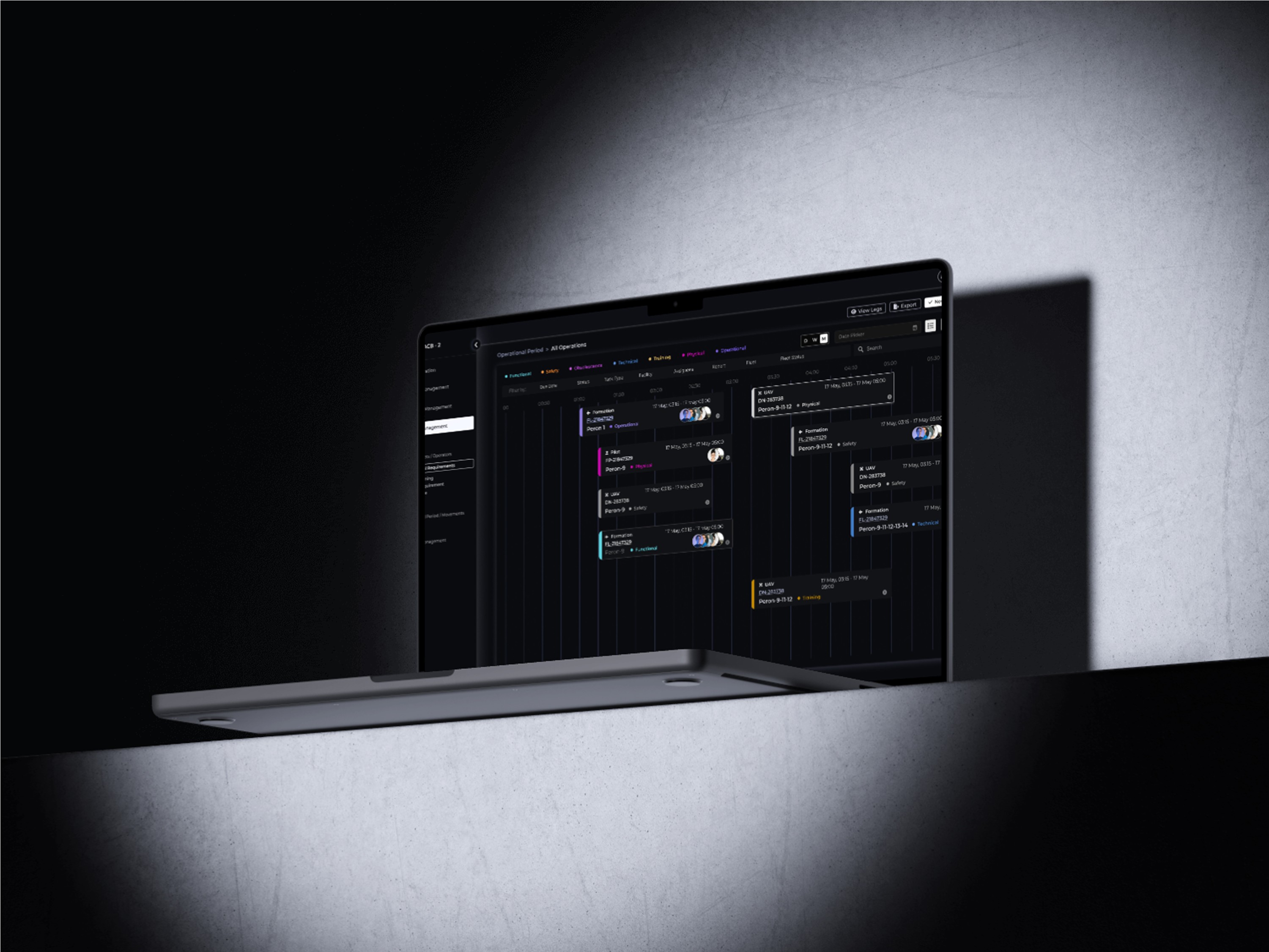
Fleet Management
Designing a desktop app to optimize fleet management and logistics coordination, from real F-16 pilot insight to prototype.
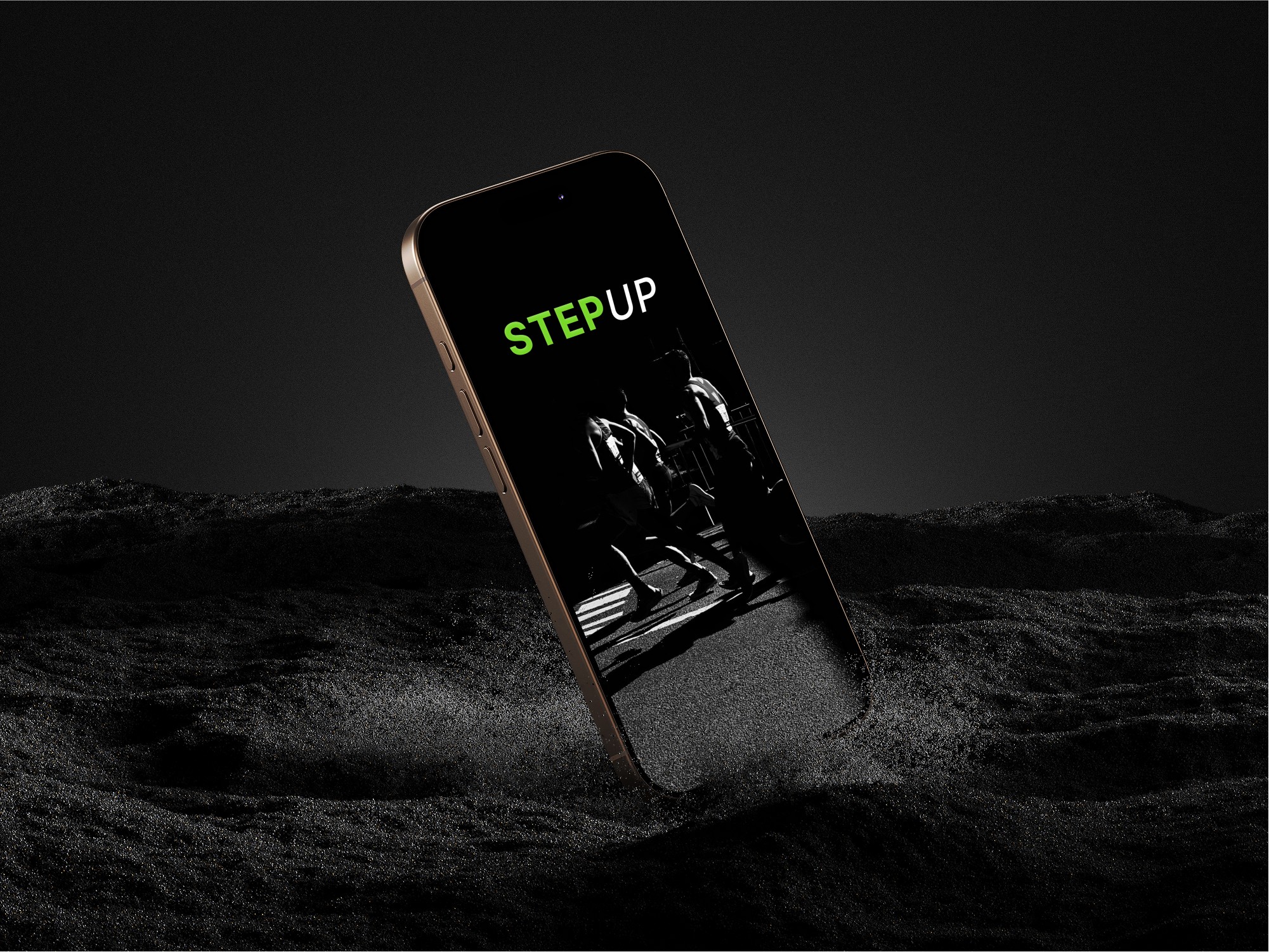
A Real Case Study: Smart Watch Application for Runners
As part of this design case, I am conducting interviews with runners to understand their needs, challenges, and motivations. By gathering insights from real users, I aim to create a solution that enhances their training experience, helps them track performance, and keeps them motivated.