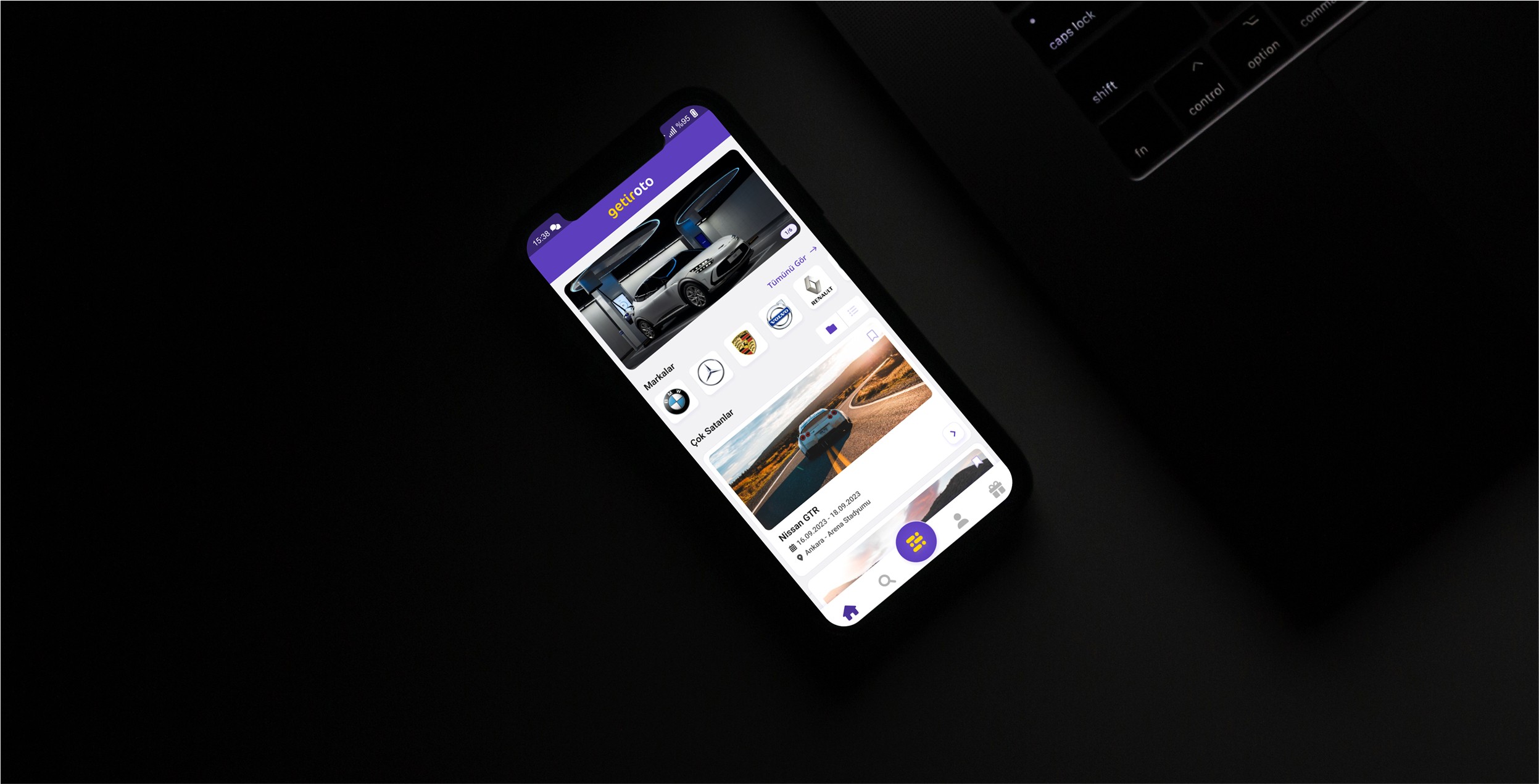
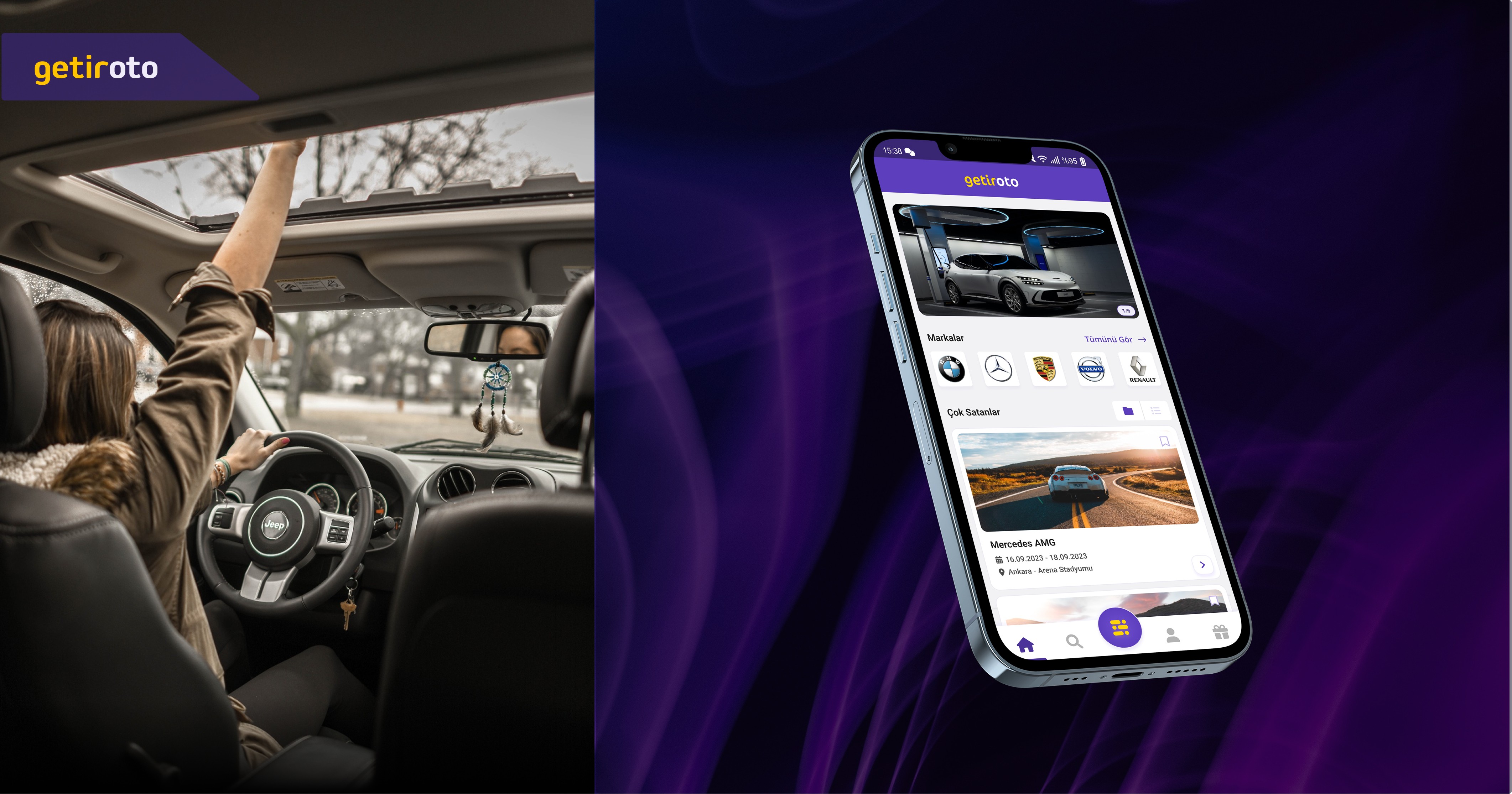
Getir Oto / Design Case
Revolutionizing the educational ecosystem with a mobile app designed to enhance interactive learning and peer collaboration.
Introduction
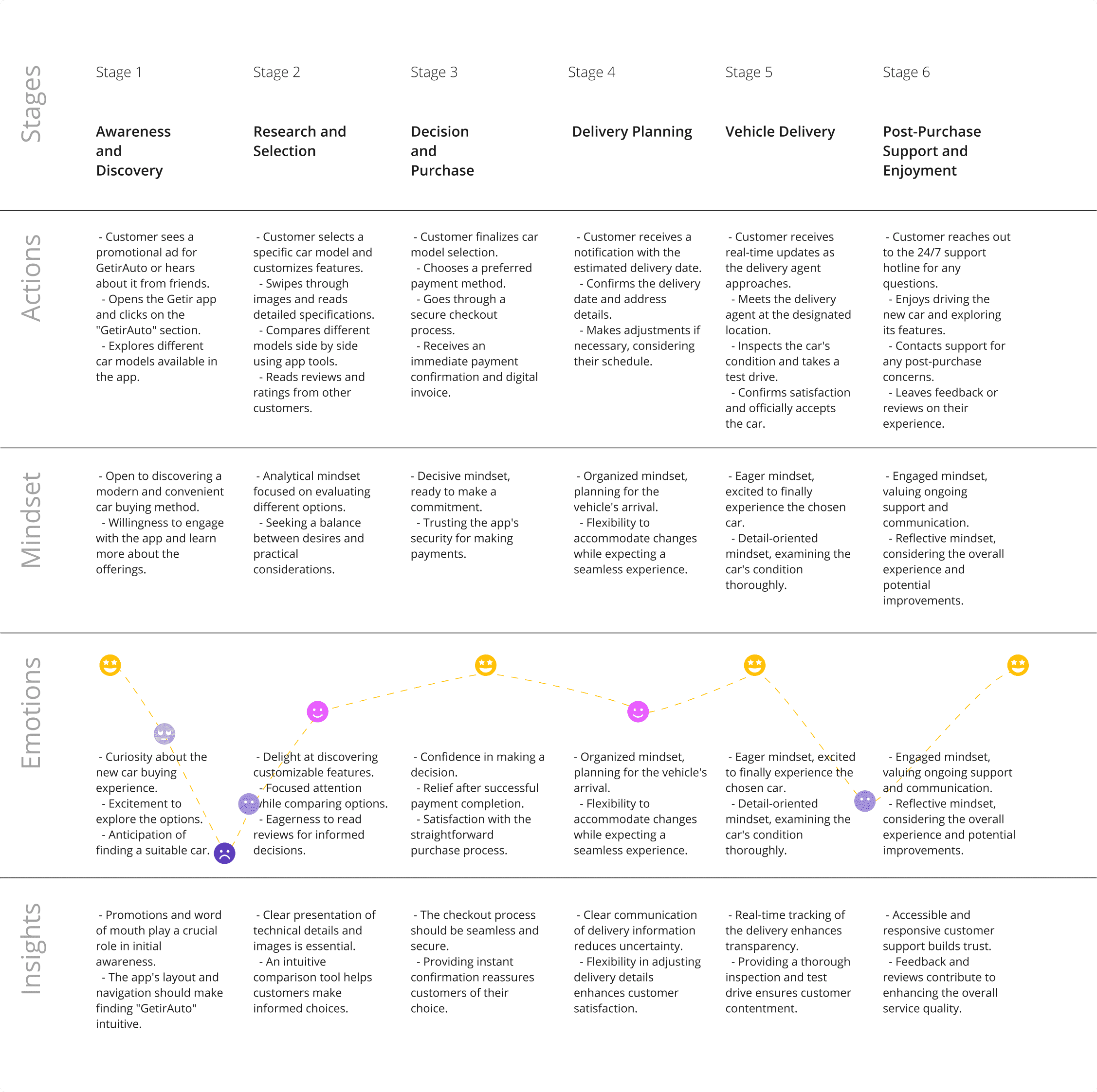
This design case explores how to create a seamless and user-friendly vehicle purchasing experience within the Getir ecosystem. The goal was to align the entire flow with Getir’s existing design system while introducing scalable solutions that enhance usability and trust. From vehicle selection to package customization, payment, and delivery, every step was designed to provide clarity and ease of use. By leveraging intuitive UI patterns and familiar interaction models, the experience ensures that users can effortlessly complete their journey. This case study demonstrates how thoughtful UX design can simplify complex decision-making processes while maintaining brand consistency.
Role
UX/UI Designer
Industry
EdTech
Year
2023
Duration
2 Weeks
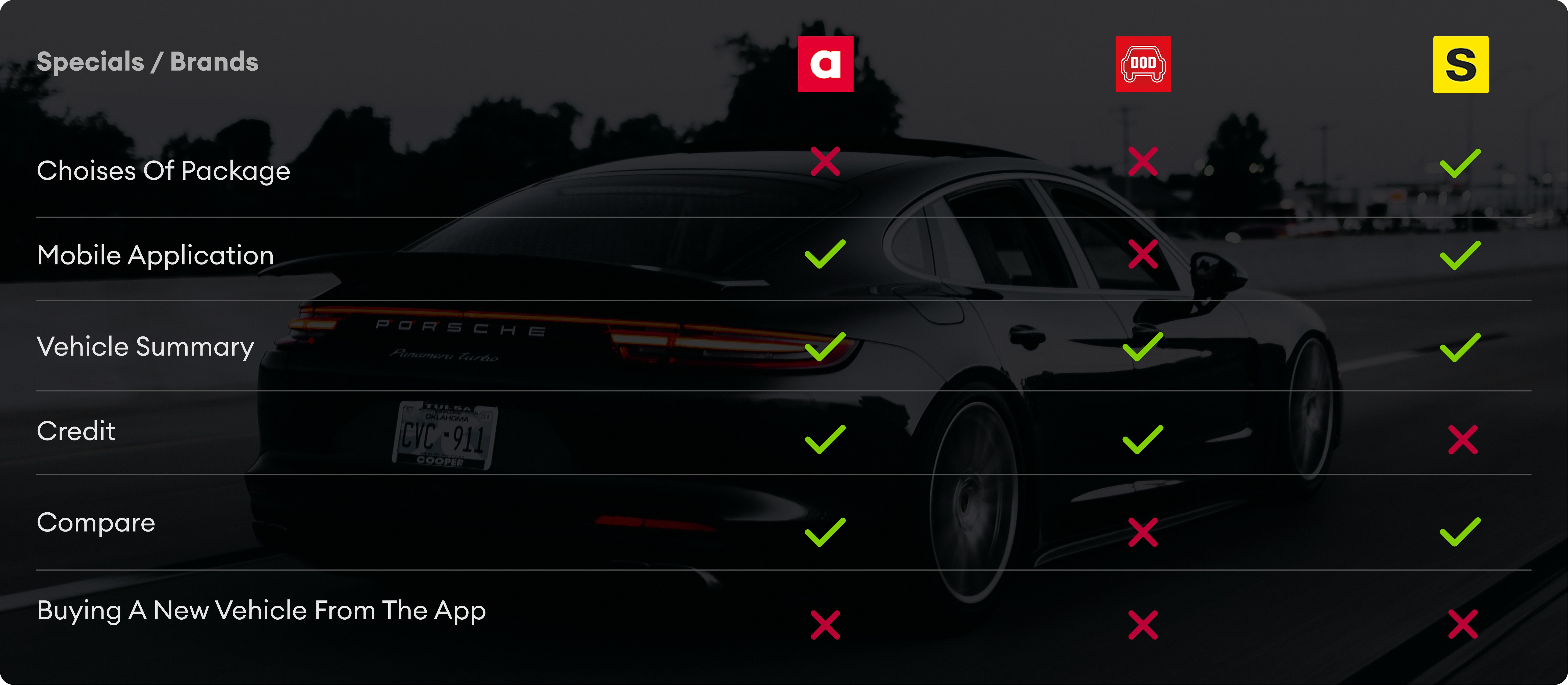
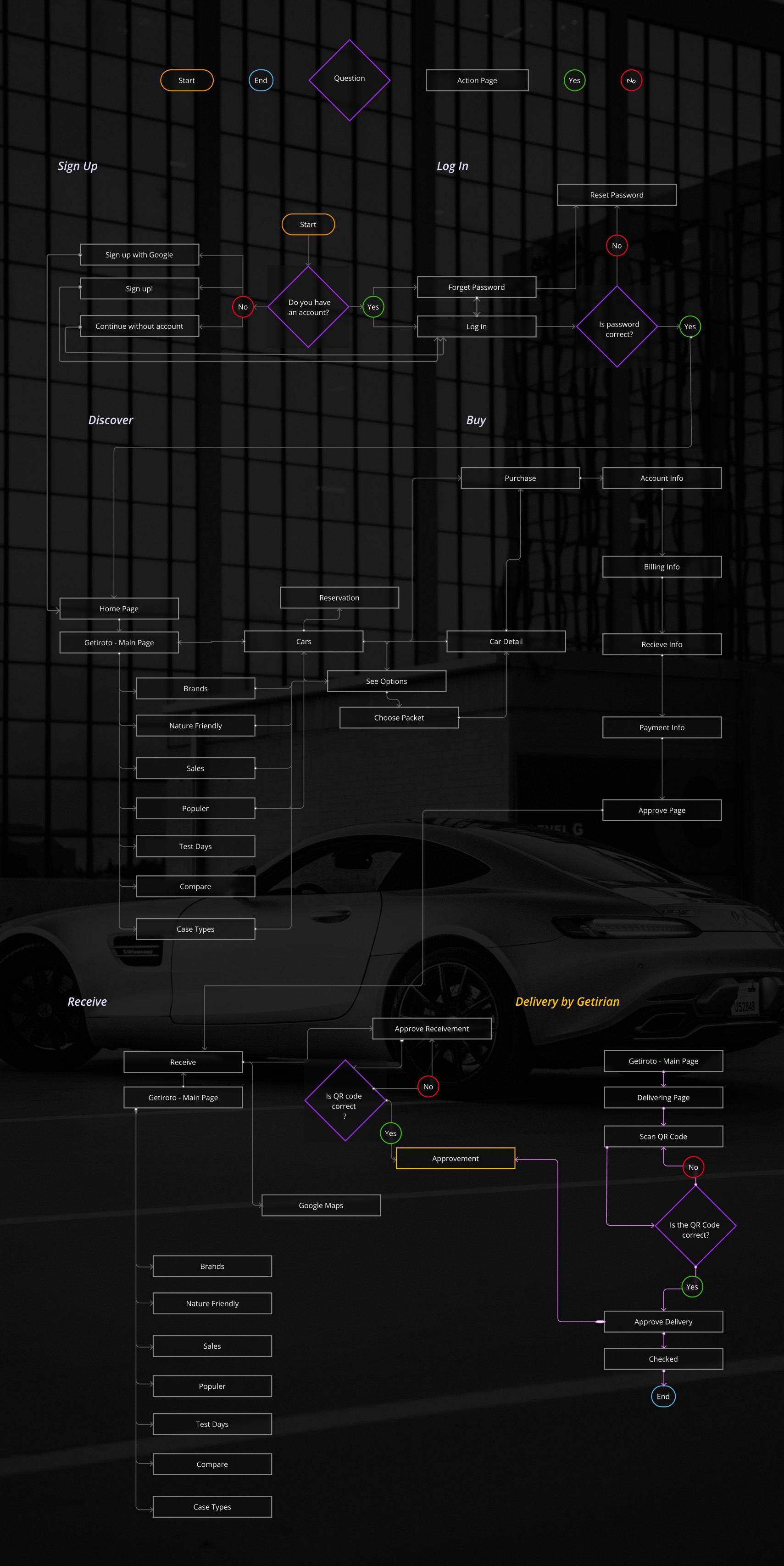
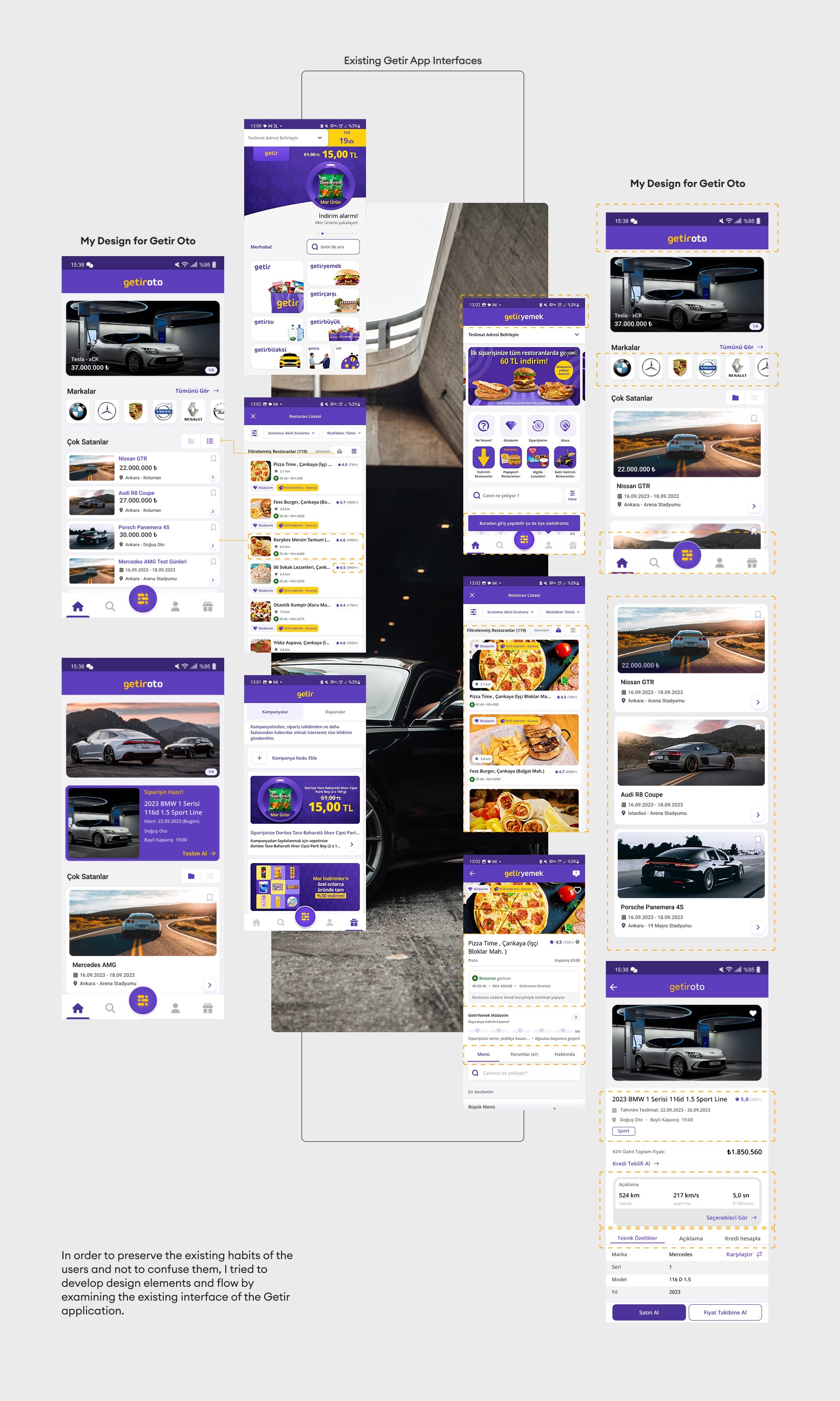
Getir User Interface Analysis
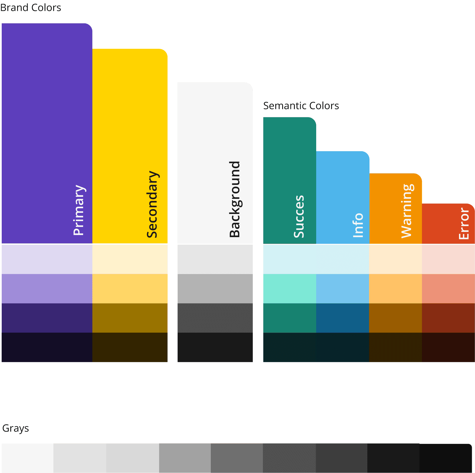
To create user experiences for Getir Oto, I decided to continue existing with user habits. Because of this aim to design my Geitr Oto application, I analyzed Getir Interface Design and found component design decisions like radiusus, grid, spacing, etc. Also, I analyzed the Getir Design System and guideline. I used their corporate identity, like color system, typography, and more..
Analysis - Getir Design System
Organized a series of remote user testing sessions, employing both qualitative and quantitative methods to evaluate the app's usability and effectiveness in fostering collaborative learning. Analyzed feedback to identify patterns and areas for improvement, leading to several design iterations that enhanced user engagement and satisfaction.
Design System
Typography

Layout System
Solutions & Design
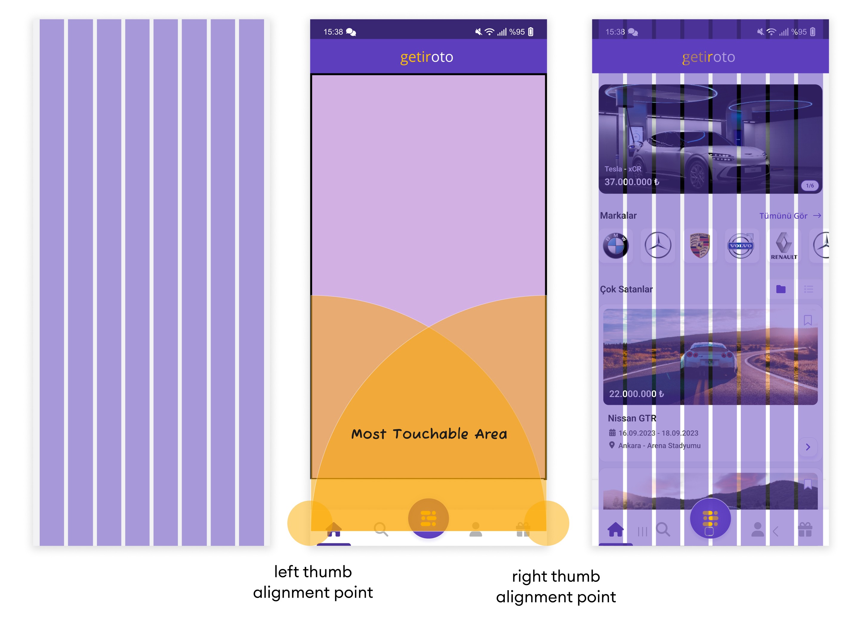
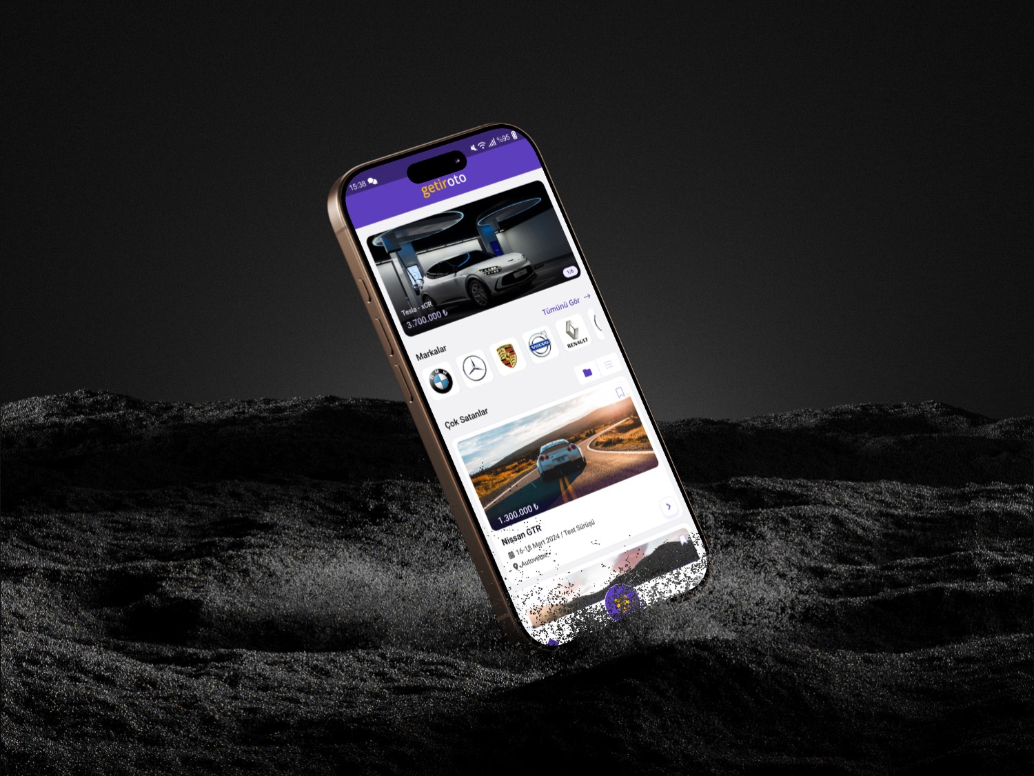
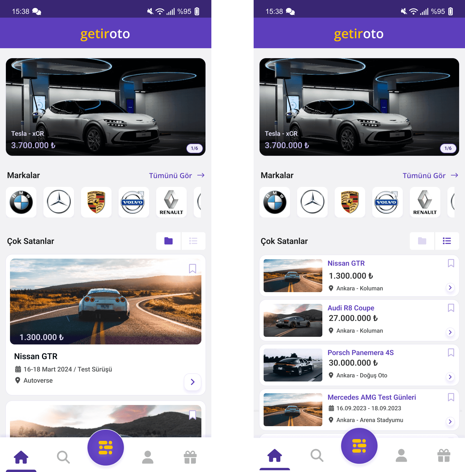
Solution 1 - Home Page
Prepared an in-depth presentation and comprehensive documentation detailing the research findings, design rationale, user testing outcomes, and the iterative design process. Highlighted the app's potential to transform the educational landscape by making learning more interactive, engaging, and collaborative.
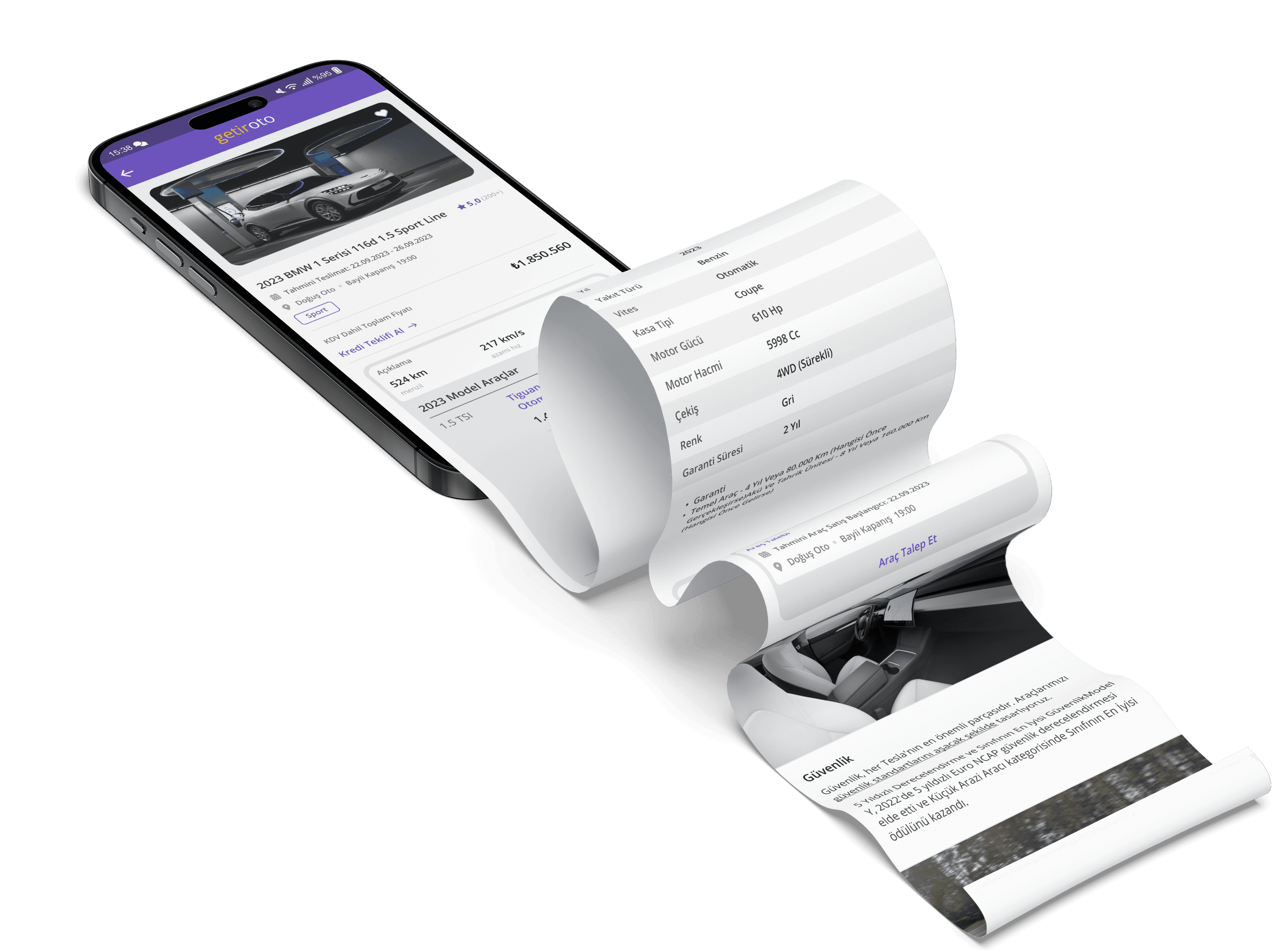
Solution 2 - Detail Page
Prepared an in-depth presentation and comprehensive documentation detailing the research findings, design rationale, user testing outcomes, and the iterative design process. Highlighted the app's potential to transform the educational landscape by making learning more interactive, engaging, and collaborative.
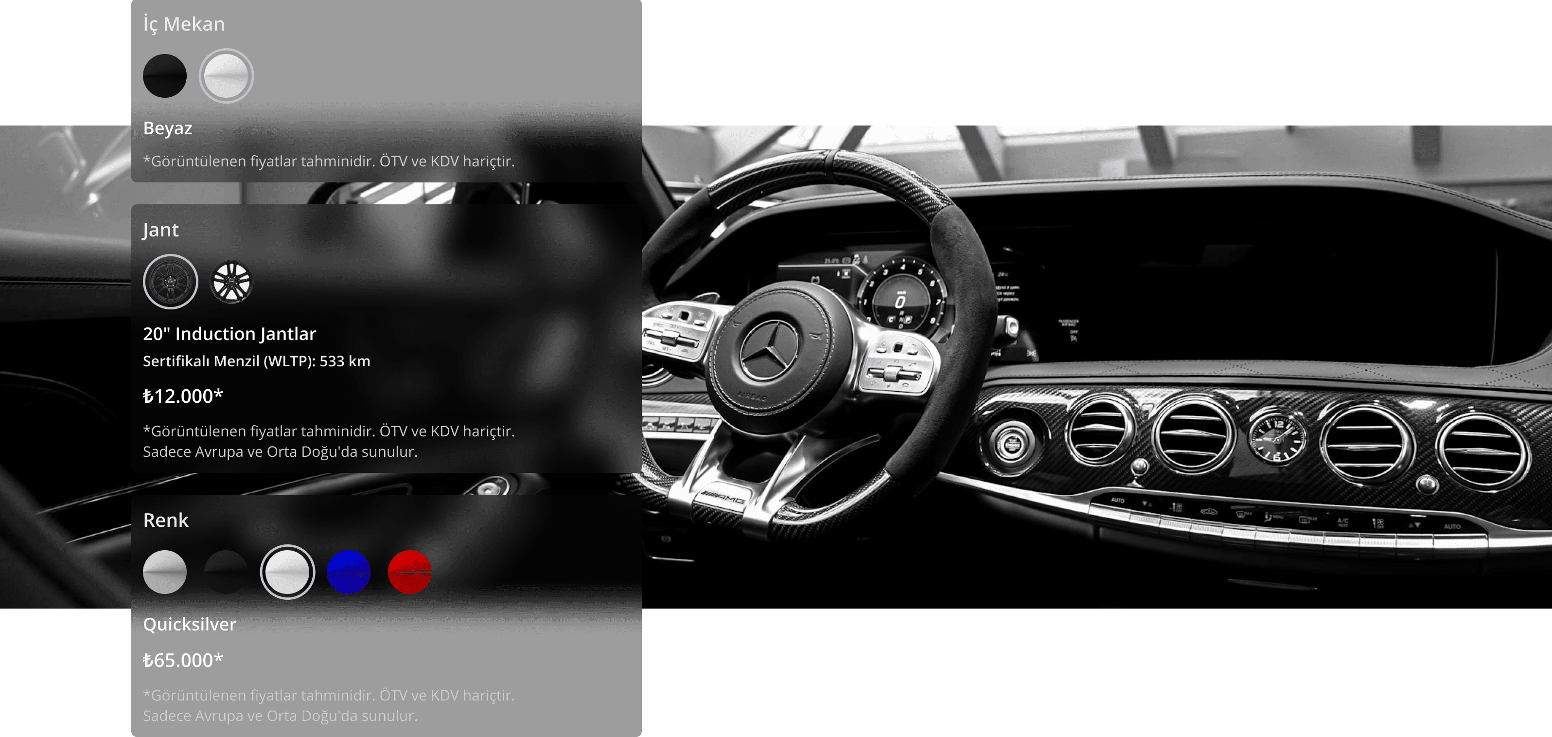
Solution 3- Create Your Own Package
To ensure that users can quickly and easily choose the most suitable vehicle package for their needs, I designed an intuitive interface. The key UX principles considered in this step include:
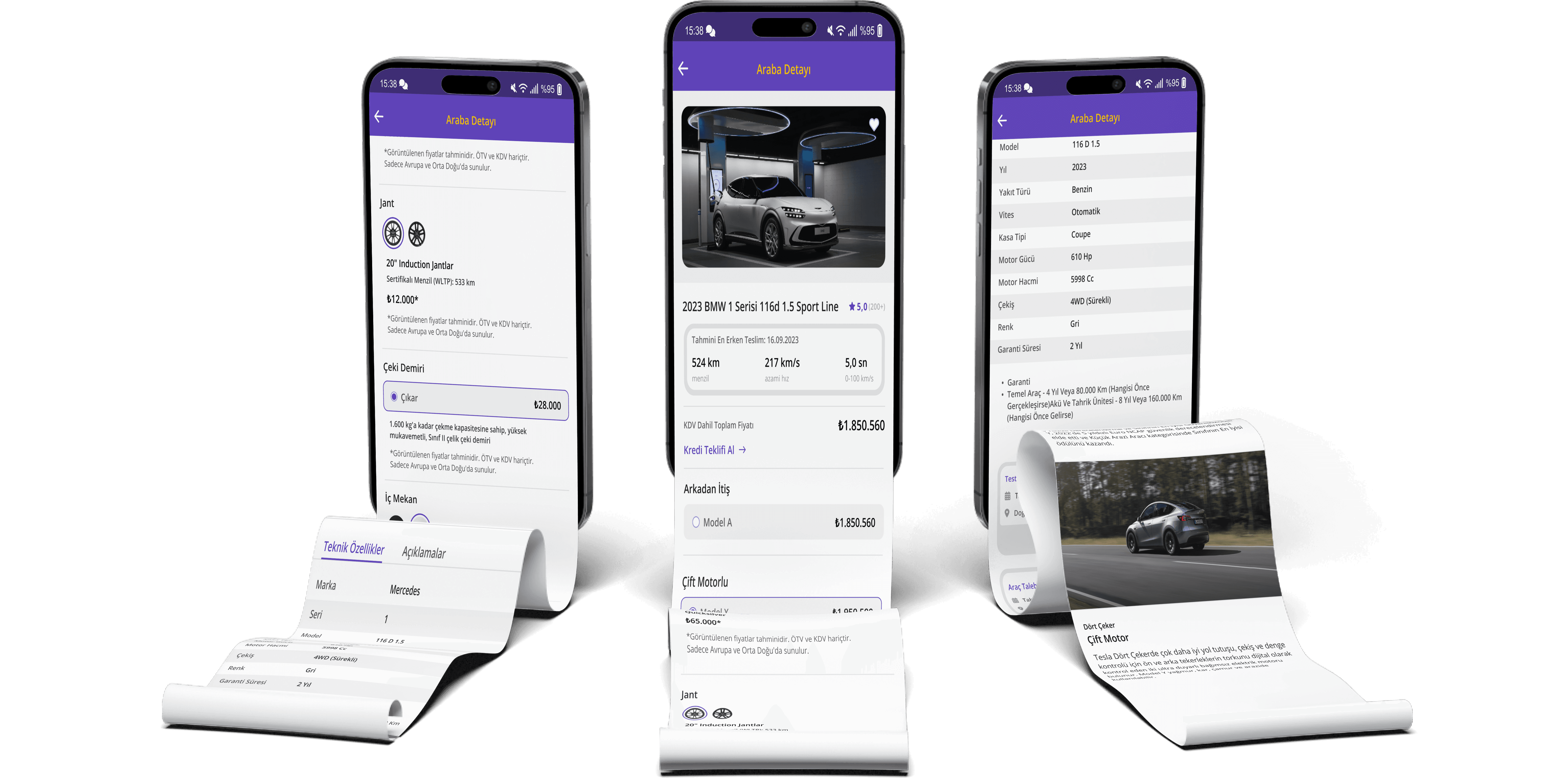
Informative and Visualized Content: Each package is presented with concise descriptions and visuals to allow users to compare options easily.
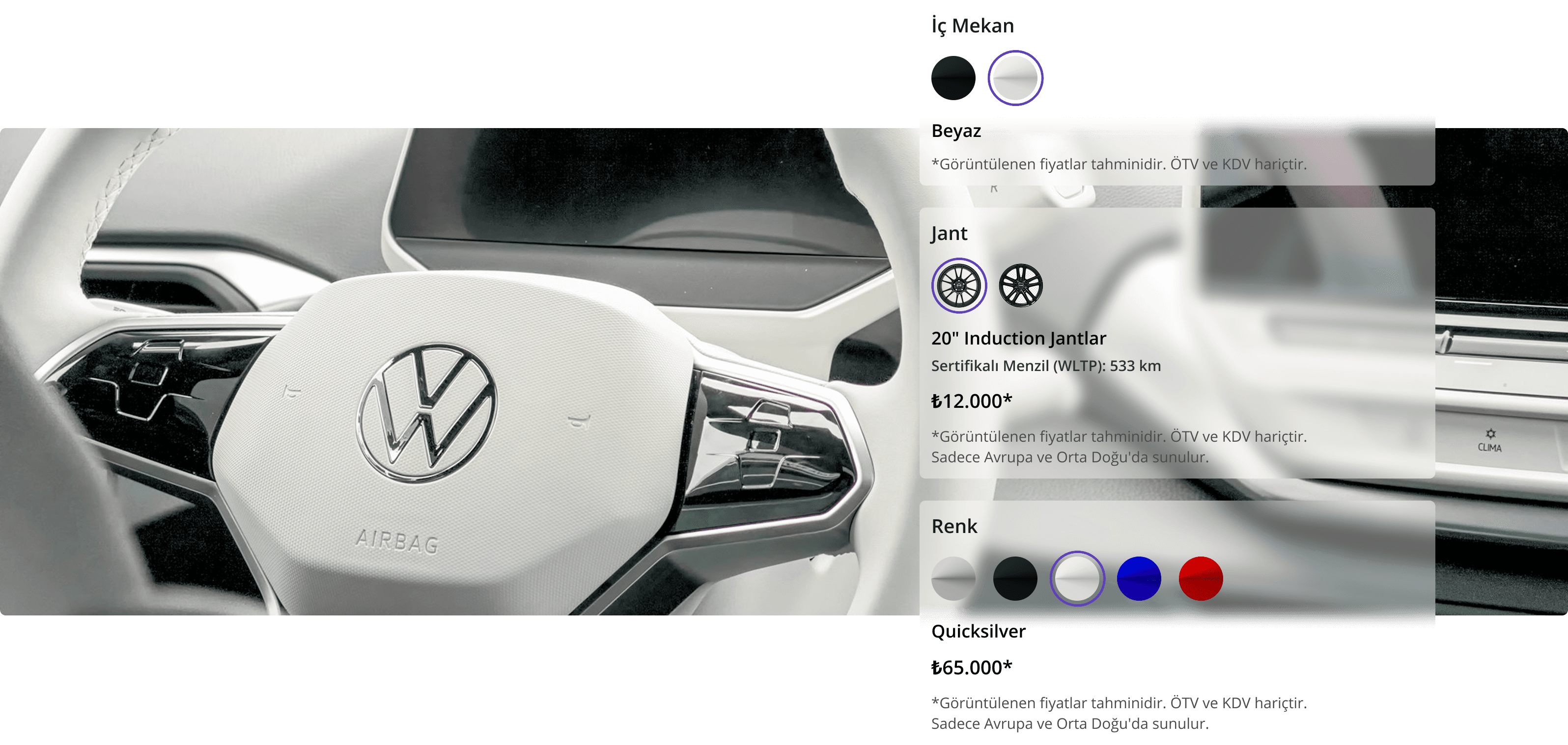
Flexibility and Personalization: Users can customize their experience by selecting optional add-ons on top of the base package.
Prioritized Information Architecture: A hierarchical presentation of information ensures that the most critical details, such as pricing and benefits, are highlighted for the user.
Real-Time Feedback Mechanisms: Users can instantly view and modify their selected package details as they make their choices.
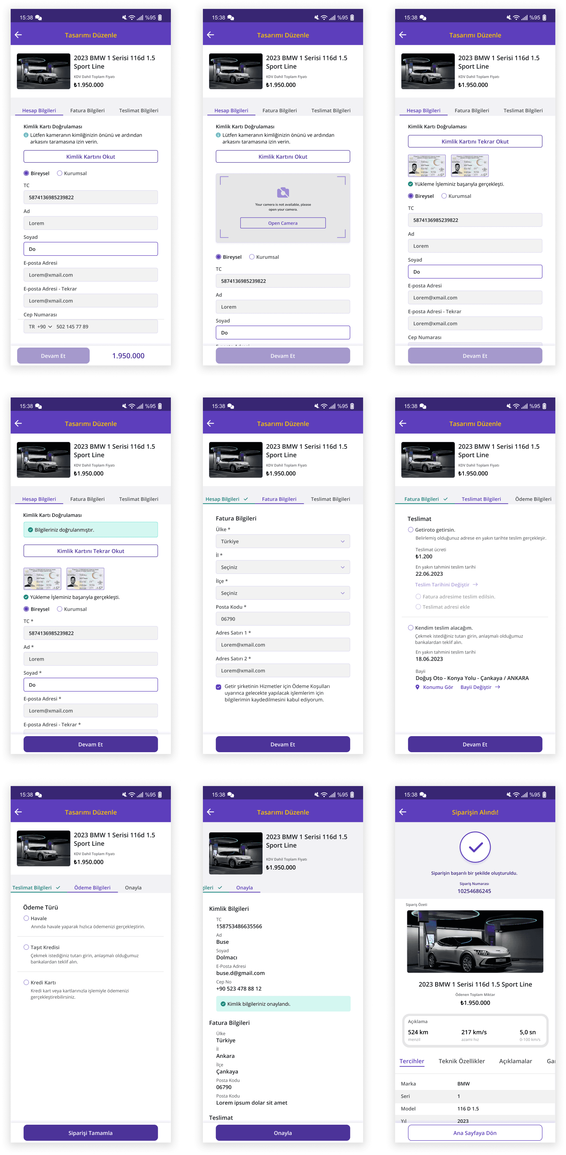
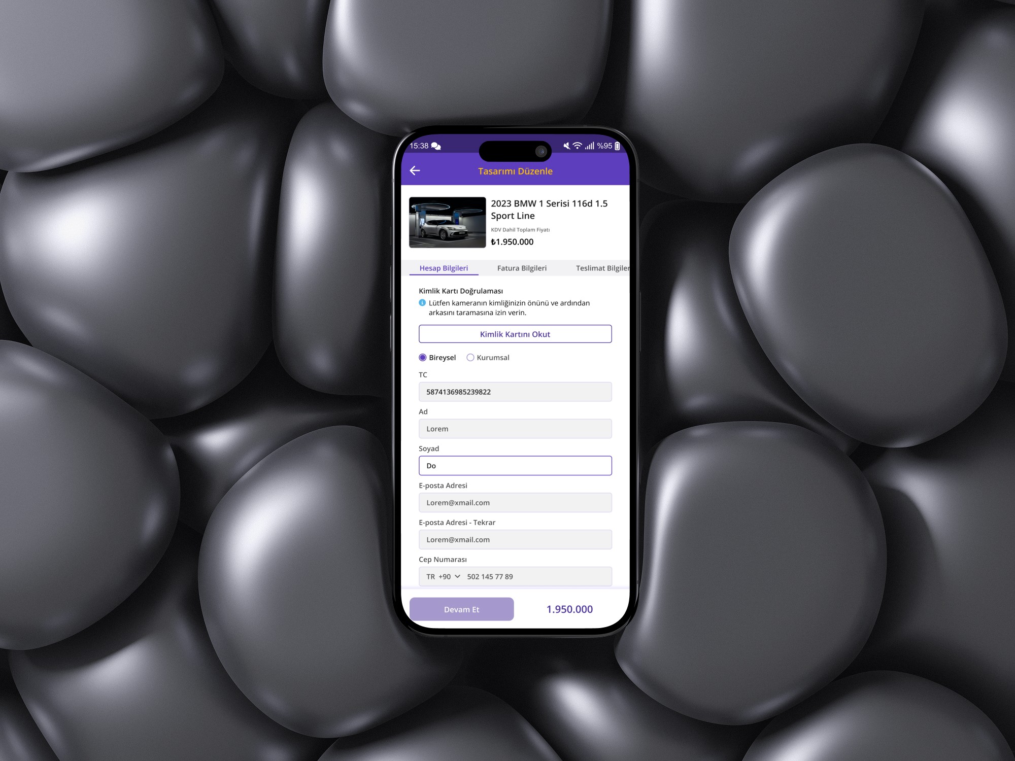
Solution 4 - Payment Process
To create a seamless and secure payment process, I implemented the following optimizations:
Step-by-Step Guidance: The payment process is divided into clear steps, allowing users to track their progress as they complete each stage.
Transparency and Trust: All costs, including extra fees, taxes, and discounts, are displayed upfront, ensuring users make informed decisions without unexpected charges.
Multiple Payment Options: Users can easily choose their preferred payment method, such as credit cards, debit cards, or digital wallets.
Error Prevention and Feedback: The system detects incomplete or incorrect payment details in real time, providing clear and actionable error messages to guide the user.
This process is designed to make vehicle selection and payment effortless while enhancing user satisfaction through a smooth and reliable experience.
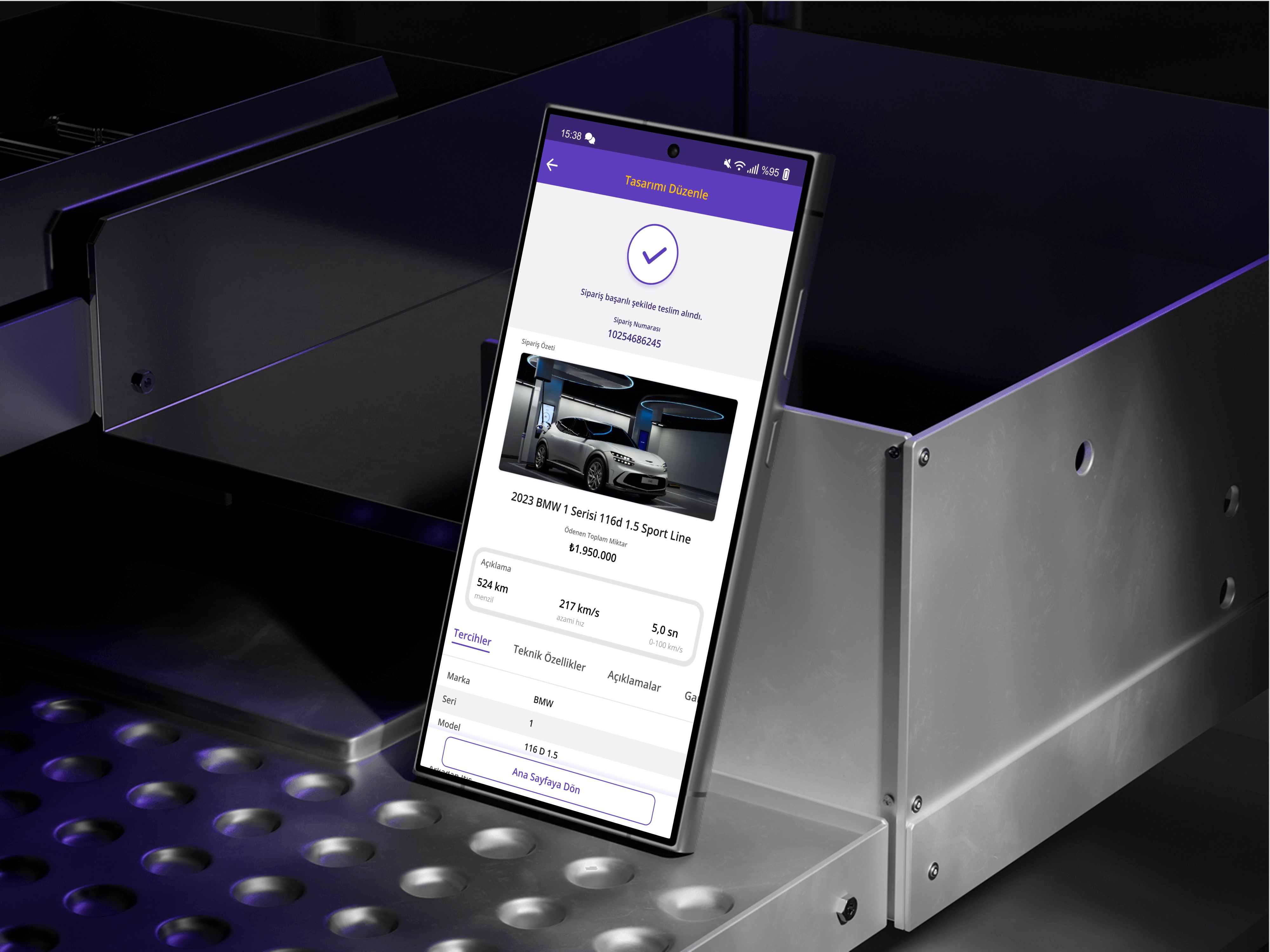
Solution 5 - Delivery Process
After the vehicle purchase, I designed a persistent card component that remains on the screen until the user successfully receives their car. This ensures easy access to essential information and provides psychological reassurance, regardless of the user’s age group.
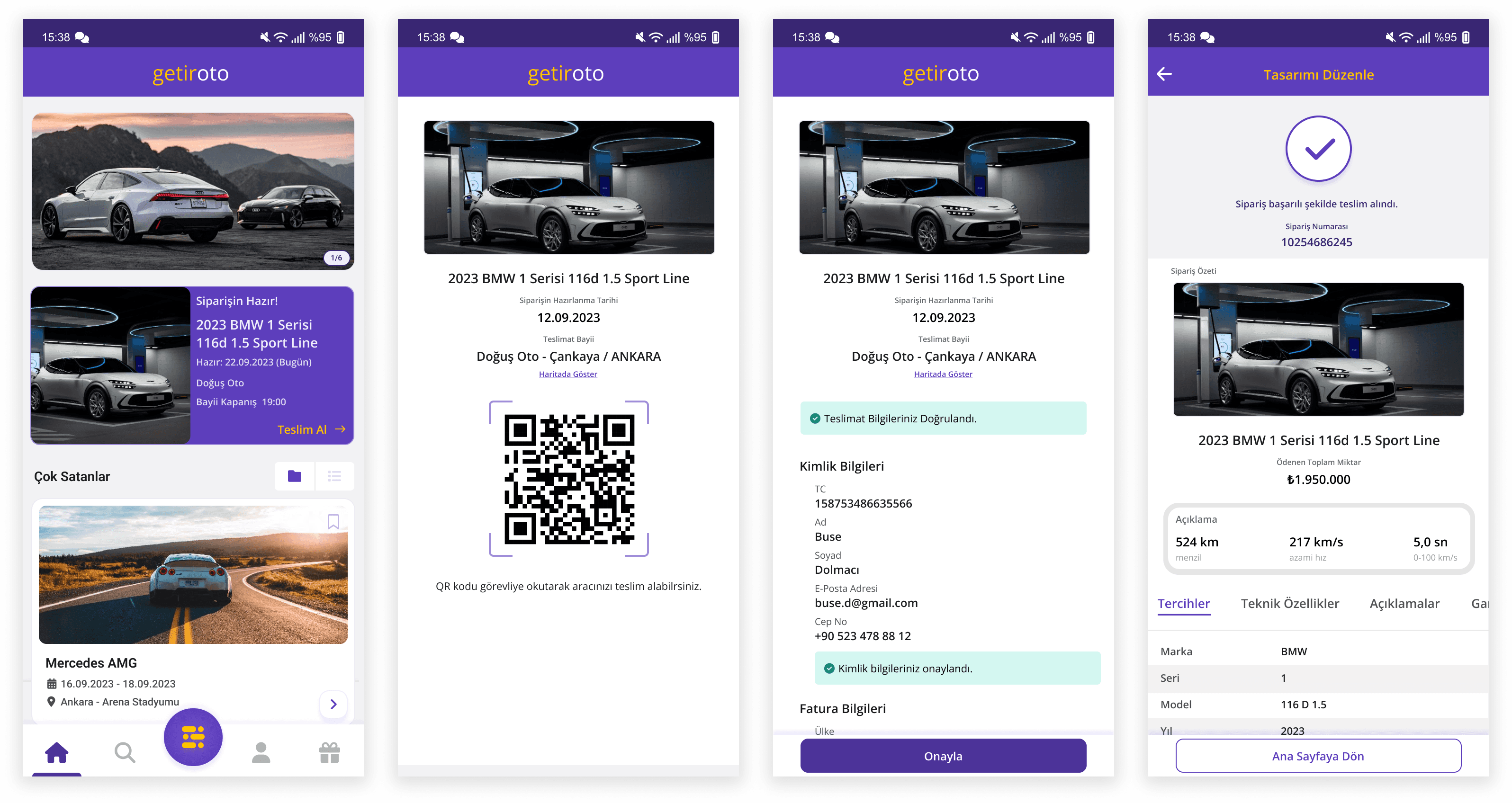
Users have two delivery options:
Home Delivery: The vehicle can be delivered directly to the user’s preferred location by Getirian.
Pickup from a Partner Dealer: Users can visit a Getir-partnered dealership and pick up their car by scanning a QR code within the app.
For both scenarios, the QR code serves as a seamless authentication method, ensuring a secure and efficient handover process. This approach minimizes friction, enhances transparency, and guarantees a smooth experience by accurately matching customers with their vehicles.

Reflections
Throughout this process, I aimed to design the entire experience in alignment with Getir’s existing design system and behavioral patterns. While doing so, I explored Getir’s design elements in depth and developed a tailored design system to ensure consistency and scalability.
Within this case study, users can seamlessly filter vehicles, customize their package based on their preferences, and manage their journey through flexible payment and delivery options. By integrating intuitive interactions and clear user flows, I designed a cohesive and user-centric experience that enhances accessibility, trust, and efficiency.

Other projects
Cybersecurity Management for Banks and Branches
ABC is a desktop app that verifies how prepared banks are against 'cybersecurity threats.'
MobileAction
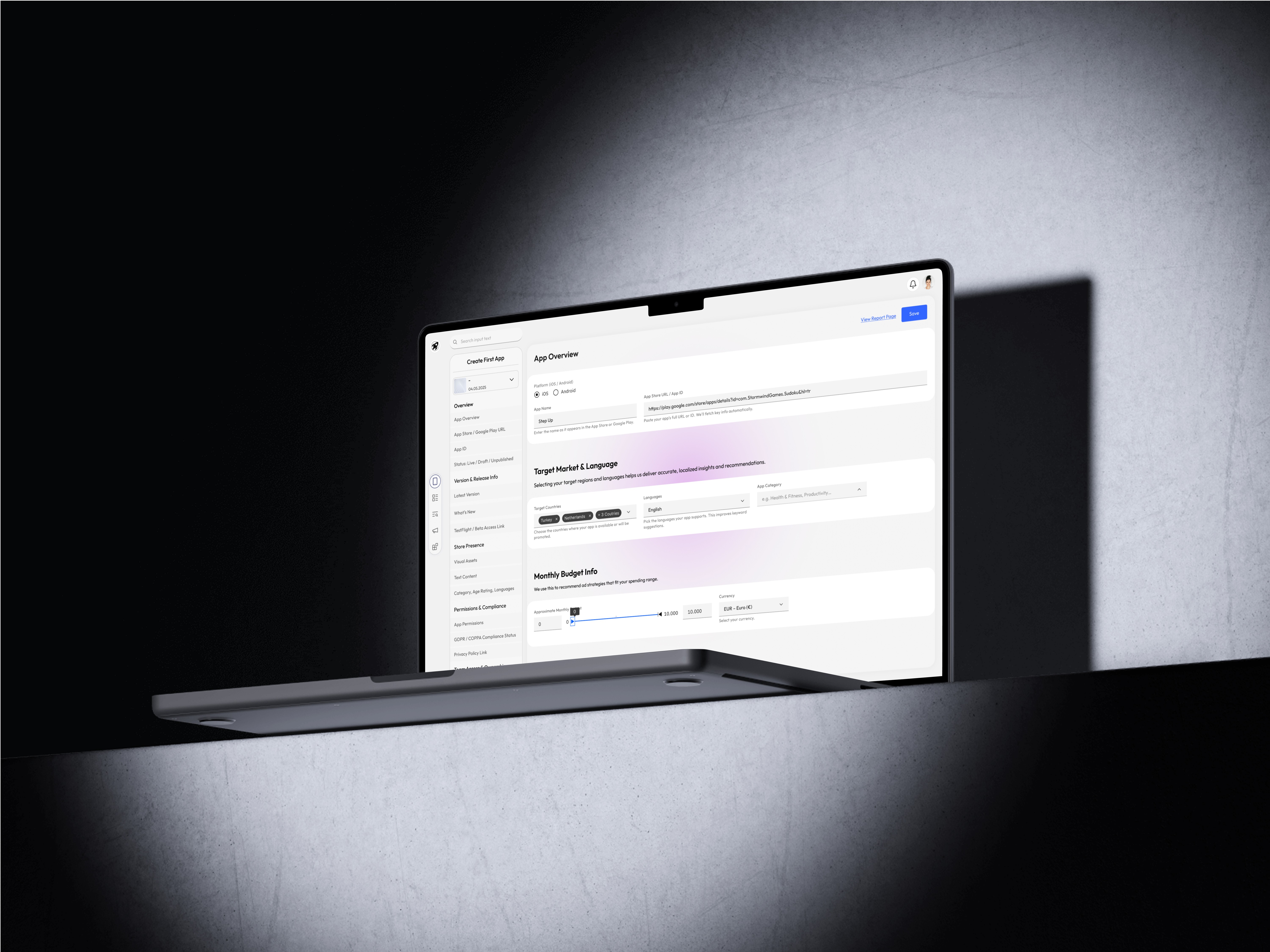
Designing a Scalable Onboarding Experience for a Powerful ASO & Ad Management Platform.
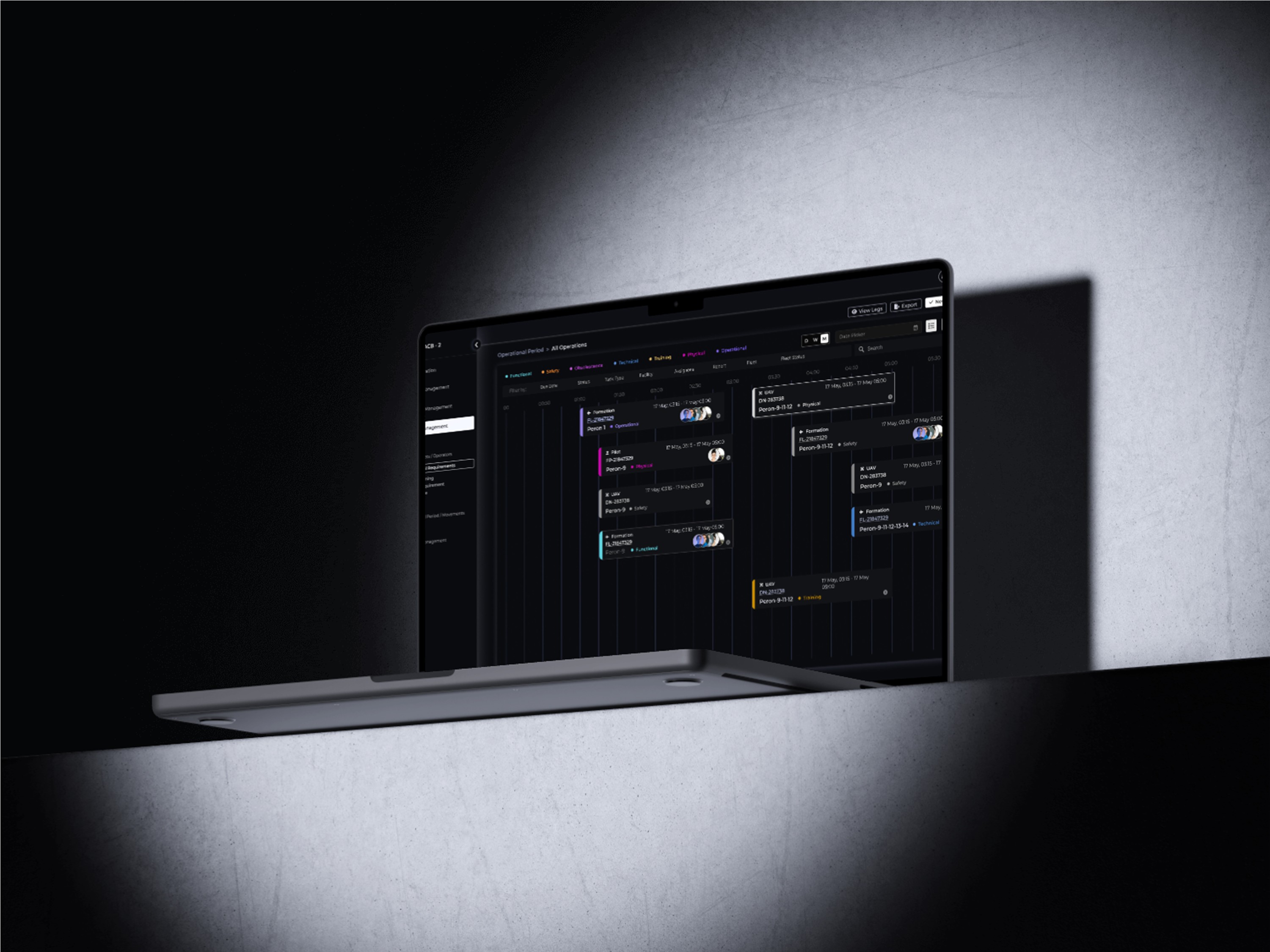
Fleet Management
Designing a desktop app to optimize fleet management and logistics coordination, from real F-16 pilot insight to prototype.
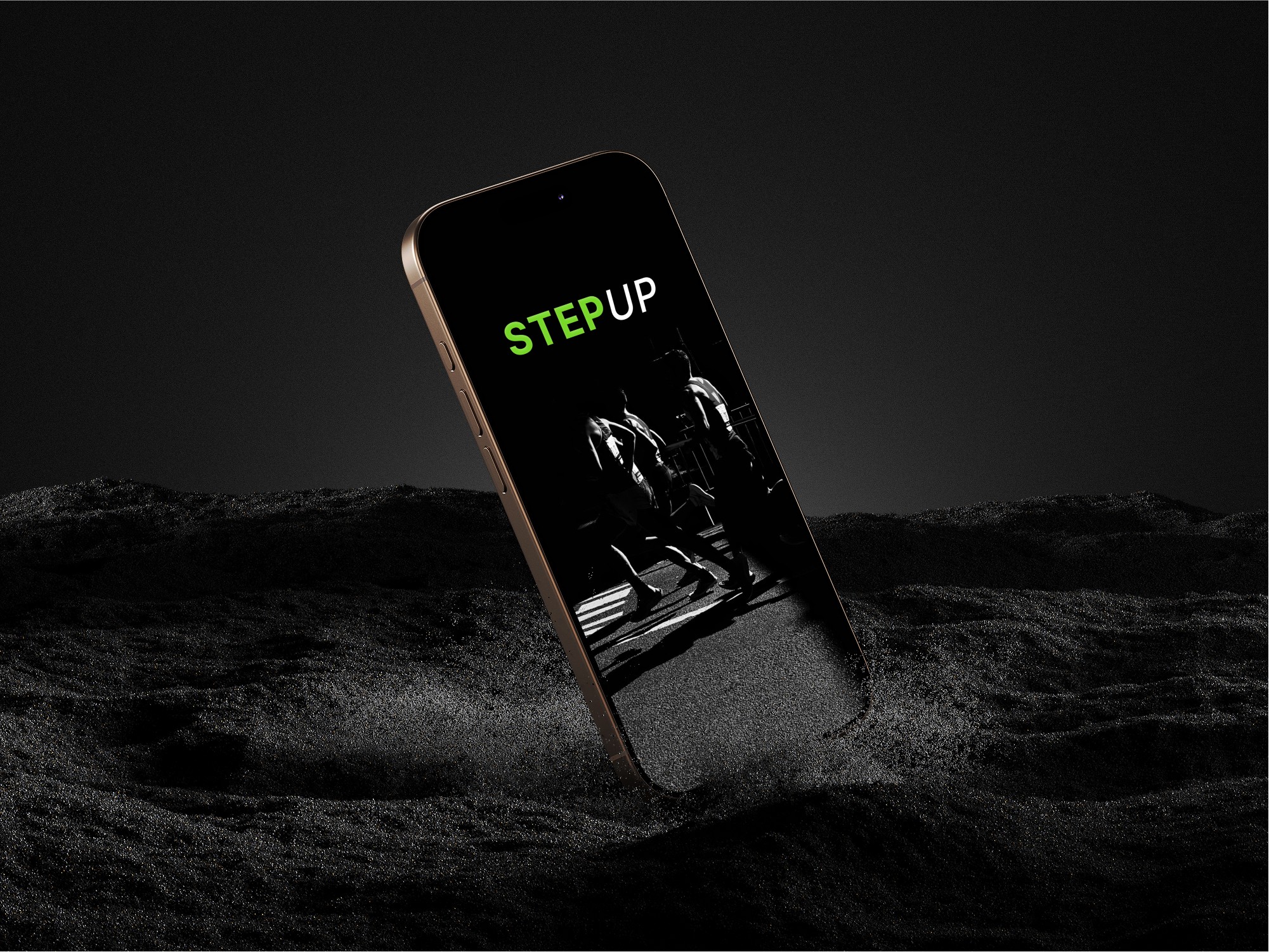
A Real Case Study: Smart Watch Application for Runners
As part of this design case, I am conducting interviews with runners to understand their needs, challenges, and motivations. By gathering insights from real users, I aim to create a solution that enhances their training experience, helps them track performance, and keeps them motivated.